{
"componentChunkName": "component---src-pages-slideshow-js",
"path": "/touchscreens/DL01/slideshow/104",
"result": {"data":{"strapiSlideshows":{"Slideshow":[{"Body":"This display went through the most experimentation. Our first idea was to 3D scan the library itself, but we soon realised that even scanning a bookshelf was hard with free tools. So, we pivoted. Each team member was scanned while posing like they were working on the other 3D printing displays. Using 300 well-lit photos per person and the free photogrammetry tool KIRI Engine, we created surprisingly detailed models. We cleaned up the scans in Blender and printed them using the Prusa Core One at Te Ara Ātea. It’s a great example of what’s possible with determination, creativity, and free software. \n\n--- \n\n**On display** \n\nArticulated models with 3D scans of exhibition team members’ faces. Created by Thea Nhien and Sasha Johnson at Selwyn Libraries. \n\n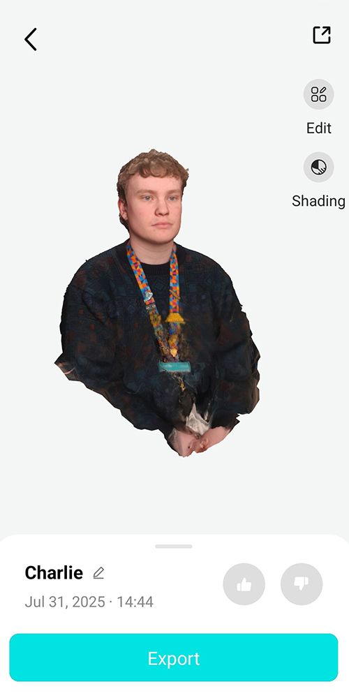 \n\n3D model of Charlie generated in Kiri engine\n\n","BodyMaori":null,"Credit":null,"MediaCaption":"Behind the scenes of 3D scanning – taking nearly 1,800 photos of staff","Title":"Thea and Sasha’s 3D scanned models ","TitleMaori":null,"PlayIconStyle":null,"id":426,"Media":{"localFile":{"publicURL":"/static/ca26937a4f7510f4a044073f94e5e79f/3_1_v2_main_51190d4655.jpg"},"mime":"image/jpeg"},"VideoPlaceholderImage":null},{"Body":"The 3D scans required some smoothing over using Blender after the intial captures generated. While the overall shape was successful, the process introduces bumps and uneven surfaces. Using Blender the models had to be carefully cleaned and smoothed, removing unwanted textures to create a polished digital mesh ready for printing and display. ","BodyMaori":null,"Credit":null,"MediaCaption":"Cleaning up the scans of Nikolai using Blender","Title":"A smooth process","TitleMaori":null,"PlayIconStyle":null,"id":427,"Media":{"localFile":{"publicURL":"/static/da57ea90d44a736c56329a7ed9cf2df4/3_2_main_2380c0d9f3.png"},"mime":"image/png"},"VideoPlaceholderImage":null},{"Body":"While the scanned heads added some personality to the models, the articulated 3D printed bodies were designed to allow for more expressive movement that could bring some life into them. The fun blend of digital design and physical play were designed to make the models engaging for tamariki and reminiscent of action figures or our annual Christmas ‘Elf on a shelf.’ \n\n\n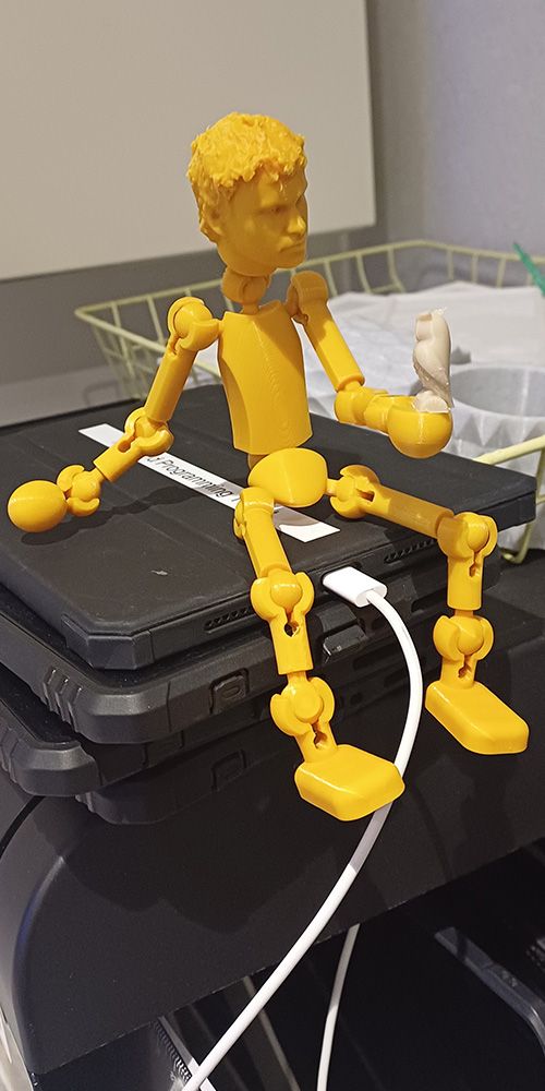 \n\nPractice posing before putting on display\n","BodyMaori":null,"Credit":null,"MediaCaption":"Thea Nhien preparing the 3D printed articulated figures for display","Title":"A playful design","TitleMaori":null,"PlayIconStyle":null,"id":428,"Media":{"localFile":{"publicURL":"/static/9e6f25ad1187cba6a74e709d601ee2ab/3_3_main_2_fb5a73b712.png"},"mime":"image/png"},"VideoPlaceholderImage":null}],"Title":"DL01 Community 03 - 3D Thea and Sasha","id":"Slideshows_104","strapiId":104,"TimeoutOverrideSeconds":null}},"pageContext":{"id":"Slideshows_104","slideshowData":{"Slideshow":[{"Body":"This display went through the most experimentation. Our first idea was to 3D scan the library itself, but we soon realised that even scanning a bookshelf was hard with free tools. So, we pivoted. Each team member was scanned while posing like they were working on the other 3D printing displays. Using 300 well-lit photos per person and the free photogrammetry tool KIRI Engine, we created surprisingly detailed models. We cleaned up the scans in Blender and printed them using the Prusa Core One at Te Ara Ātea. It’s a great example of what’s possible with determination, creativity, and free software. \n\n--- \n\n**On display** \n\nArticulated models with 3D scans of exhibition team members’ faces. Created by Thea Nhien and Sasha Johnson at Selwyn Libraries. \n\n \n\n3D model of Charlie generated in Kiri engine\n\n","BodyMaori":null,"Credit":null,"MediaCaption":"Behind the scenes of 3D scanning – taking nearly 1,800 photos of staff","Title":"Thea and Sasha’s 3D scanned models ","TitleMaori":null,"id":426,"PlayIconStyle":null,"Media":{"localFile":{"publicURL":"/static/ca26937a4f7510f4a044073f94e5e79f/3_1_v2_main_51190d4655.jpg"},"mime":"image/jpeg"}},{"Body":"The 3D scans required some smoothing over using Blender after the intial captures generated. While the overall shape was successful, the process introduces bumps and uneven surfaces. Using Blender the models had to be carefully cleaned and smoothed, removing unwanted textures to create a polished digital mesh ready for printing and display. ","BodyMaori":null,"Credit":null,"MediaCaption":"Cleaning up the scans of Nikolai using Blender","Title":"A smooth process","TitleMaori":null,"id":427,"PlayIconStyle":null,"Media":{"localFile":{"publicURL":"/static/da57ea90d44a736c56329a7ed9cf2df4/3_2_main_2380c0d9f3.png"},"mime":"image/png"}},{"Body":"While the scanned heads added some personality to the models, the articulated 3D printed bodies were designed to allow for more expressive movement that could bring some life into them. The fun blend of digital design and physical play were designed to make the models engaging for tamariki and reminiscent of action figures or our annual Christmas ‘Elf on a shelf.’ \n\n\n \n\nPractice posing before putting on display\n","BodyMaori":null,"Credit":null,"MediaCaption":"Thea Nhien preparing the 3D printed articulated figures for display","Title":"A playful design","TitleMaori":null,"id":428,"PlayIconStyle":null,"Media":{"localFile":{"publicURL":"/static/9e6f25ad1187cba6a74e709d601ee2ab/3_3_main_2_fb5a73b712.png"},"mime":"image/png"}}],"Title":"DL01 Community 03 - 3D Thea and Sasha","id":"Slideshows_104","strapiId":104},"homePath":"/touchscreens/DL01","backPath":"/touchscreens/DL01/menu/4","title":"DIGITAL LABEL 01
English","showLanguageButtons":null,"styles":"html,body {\n font-family: Gotham;\n height: 100%;\n margin: 0px;\n padding: 0px;\n}\n\n* {\n -webkit-user-select: none;\n -khtml-user-select: none;\n -moz-user-select: none;\n -o-user-select: none;\n user-select: none;\n}\n\nh1 {\n color: #231f20;\n margin: -20px 0 0 0;\n font-family: 'IndustryIncInline';\n font-size: 80px;\n text-transform: uppercase;\n}\n\nh3 {\n color: #231f20;\n font-size: 12px;\n text-transform: uppercase;\n line-height: 2em;\n}\n\nh3.subpage-touchscreen-title {\n font-family: 'DIN2014';\n font-size: 20px;\n text-transform: uppercase;\n margin-top: -18px;\n}\n\na {\n text-decoration: none;\n}\n\n.menu-page-icon-container h1, .touchscreen-menu-items-container h1 {\n width: 900px;\n min-height: 2em;\n}\n\n.menu-page-icon-container.with-sidebar h1 {\n width: auto !important;\n}\n\n.page-container {\n margin: 0;\n padding: 70px 100px 0;\n position: relative;\n height: 100%;\n background: #ebebeb;\n}\n\nmain {\n width: 1920px;\n height: 1080px;\n}\n\n.hidden {\n display: none;\n}\n\n.nav {\n position: absolute;\n top: 60px;\n left: 0;\n z-index: 999;\n}\n\n.nav div, .nav a {\n display: block;\n width: 80px;\n height: 80px;\n float: left;\n}\n\n.nav .home {\n background: url(\"/SVG/Buttons/btn_home_light.svg\");\n}\n\n.nav .back {\n background: url(\"/SVG/Buttons/btn_arrow_prev.svg\");\n}\n\n.zoom-btn, .zoom-btn-fixed {\n display: block;\n width: 80px;\n height: 80px;\n position: absolute;\n top: 60px;\n right: 0;\n z-index: 999;\n background: url(\"/SVG/Buttons/btn_zoom_light.svg\");\n}\n\n.zoom-btn-fixed {\n right: 576px;\n}\n\n.play-btn {\n display: block;\n width: 80px;\n height: 80px;\n position: absolute;\n top: 50%;\n right: 50%;\n z-index: 999;\n background: url(\"/SVG/Buttons/btn_play.svg\");\n margin-right: -40px;\n margin-top: -40px;\n}\n\n.play-btn-audio {\n display: block;\n width: 80px;\n height: 80px;\n position: absolute;\n z-index: 999;\n background: url(\"/SVG/Buttons/btn_Audio.svg\");\n}\n\n.fancybox-button--close, .fancybox-close-small {\n position: fixed !important;\n width: 80px !important;\n height: 80px !important;\n background: url(\"/SVG/Buttons/btn_close.svg\") !important;\n}\n\n.fancybox-button--close svg, .fancybox-close-small svg {\n display: none !important;\n}\n\n.fancybox-button--zoom {\n display: none !important;\n}\n\n.fancybox-toolbar {\n width: 80px;\n}\n\n.video-js {\n background-color: #212121 !important;\n}\n\n.bg-div {\n background-size: cover !important;\n}\n\n.bg-video {\n position: fixed;\n right: 0;\n bottom: 0;\n min-width: 100%;\n min-height: 100%;\n z-index: 1;\n transition: 1s;\n}\n\n.halfFade {\n opacity: 0.2;\n}\n\n.touchscreen-page {\n background-color: #ebebeb00;\n}\n\n.touchscreen-page .nav {\n opacity: 0;\n transition: 1s;\n}\n\n.fadeIn {\n opacity: 1 !important;\n}\n\n.touchscreen-menu-items-container {\n transition: 1s;\n position: absolute;\n left: 1920px;\n top: 0;\n width: 1920px;\n height: 1080px;\n z-index: 100;\n}\n\n.touchscreen-menu-items-container-slide-in {\n left: 0;\n}\n\n.touchscreen-menu-items {\n z-index: 100;\n position: relative;\n width: 1720px;\n text-align: center;\n}\n\n.touchscreen-menu-items a {\n width: 600px;\n height: 600px;\n max-width: 600px;\n max-height: 600px;\n display: inline-block;\n margin: 90px 4px 0;\n}\n\n.touchscreen-menu-items a img {\n max-width: 600px;\n max-height: 600px;\n filter: grayscale(100%);\n}\n\n.touchscreen-menu-items a p {\n text-transform: uppercase;\n margin: 0;\n font-family: \"DIN2014\";\n width: 600px;\n padding: 10px;\n color: #231f20;\n white-space: nowrap;\n position: absolute;\n bottom: 0px;\n background-color: rgba(208, 210, 211, 0.8);\n height: 50px;\n text-align: left;\n bottom: 3px;\n}\n\n.touchscreen-text {\n transition: 1s;\n position: relative;\n left: 0;\n z-index: 100;\n}\n\n.touchscreen-text-slide-out {\n left: -1920px;\n}\n\n.touchscreen-text h1 {\n font-size: 160px;\n margin: 0;\n}\n\n.touchscreen-text h3 {\n font-size: 32px;\n font-weight: 200;\n padding-left: 20px;\n}\n\n.menu-page-items {\n height: 760px;\n position: relative;\n}\n\n.with-sidebar .menu-page-items {\n height: 870px !important;\n}\n\n.vertical-align {\n/* Center slide text vertically */\n \n\n\n display: -webkit-box;\n display: -ms-flexbox;\n display: -webkit-flex;\n display: flex;\n -webkit-box-pack: center;\n -ms-flex-pack: center;\n -webkit-justify-content: center;\n justify-content: center;\n -webkit-box-align: center;\n -ms-flex-align: center;\n -webkit-align-items: center;\n align-items: center;\n}\n\n.menu-page-infobox {\n display: none;\n}\n\n.menu-page-icon-container {\n color: #fff;\n width: 1820px;\n}\n\n.with-sidebar .menu-page-items-container {\n width: 1244px !important;\n}\n\n.menu-page-sidebar .swiper-zoom-container {\n position: relative;\n}\n\n.menu-page-sidebar .play-btn {\n left: auto !important;\n top: auto !important;\n right: auto !important;\n}\n\n.menu_item {\n position: relative;\n float: left;\n min-height: 1px;\n width: 340px;\n margin: 5px;\n}\n\n.menu_item img {\n filter: sepia(0) grayscale(100%);\n transition: .3s ease-in-out;\n display: block;\n width: 100%;\n max-width: none;\n height: 100%;\n object-fit: cover;\n}\n\n.menu_item p {\n text-transform: uppercase;\n margin: 0;\n font-family: \"DIN2014\";\n width: 100%;\n padding: 10px;\n color: #231f20;\n white-space: nowrap;\n position: absolute;\n bottom: 0;\n background-color: rgba(208, 210, 211, 0.9);\n min-height: 50px;\n}\n\n.menu_item.active p {\n background-color: rgba(255, 255, 255, 0.9);\n}\n\n.menu_item.active img {\n filter: sepia(75%) grayscale(0) !important;\n}\n\n.menu-page-icon-container.with-sidebar .menu_item {\n width: 270px;\n}\n\n.menu-page-icon-container {\n width: auto;\n}\n\n.main-slide {\n width: 100%;\n height: 100%;\n}\n\n.main-slide img {\n max-width: 80% !important;\n max-height: 910px !important;\n box-shadow: 3px 2px 20px 0px rgba(0, 0, 0, 0.2);\n}\n\n.video-fullscreen {\n width: 1820px;\n background: transparent !important;\n}\n\n.swiper-container {\n margin: 0 !important;\n background: rgb(235, 235, 235);\n}\n\n.swiper-main {\n width: 70%;\n height: 88%;\n position: absolute;\n left: 0px;\n top: 0;\n}\n\n.vjs-tech {\n pointer-events: none;\n}\n\n\n\n/* .fancybox-bg {background:lightgrey !important;} */\n\n\n\n.swiper-infobox {\n width: 30%;\n height: 100%;\n position: absolute !important;\n right: 0;\n top: 0;\n}\n\n.swiper-infobox .infobox h3 {\n margin-top: 200px;\n font-size: 32px;\n font-family: \"DIN2014\";\n letter-spacing: 0.1em;\n line-height: 1em;\n}\n\n.swiper-infobox .infobox {\n max-width: 410px;\n margin-left: 30px;\n font-weight: 100;\n}\n\n.swiper-infobox .infobox img {\n width: 100%;\n}\n\n.swiper-infobox .infobox .text {\n height: 590px;\n overflow: auto;\n padding-right: 10px;\n}\n\n.menu-page-sidebar .text {\n height: 860px !important;\n ;\n}\n\n::-webkit-scrollbar {\n width: 5px;\n height: 5px;\n}\n\n::-webkit-scrollbar-track {\n background: rgba(0, 0, 0, 0.1);\n}\n\n::-webkit-scrollbar-thumb {\n background: rgba(0, 0, 0, 0.5);\n}\n\n.swiper-scrollbar {\n height: 6px;\n}\n\n.swiper-caption {\n width: 70%;\n height: 12%;\n position: absolute;\n left: 0px;\n bottom: 0px;\n}\n\n.swiper-caption .caption {\n position: absolute;\n left: 30px;\n top: 10px;\n font-weight: 200;\n text-align: left;\n font-size: 14px;\n max-width: 650px;\n line-height: 1;\n}\n.swiper-caption .credit {\n position: absolute;\n left: 30px;\n top: 60px;\n}\nblockquote, .swiper-caption .credit {\n font-weight: 100;\n ;\n text-align: left;\n font-size: 12px;\n max-width: 650px;\n line-height: 1;\n}\nblockquote {margin: 0 !important;}\n\n.swiper-scrollbar {\n border-radius: 10px;\n position: relative;\n -ms-touch-action: none;\n background: rgba(0, 0, 0, .1);\n}\n\n.swiper-container > .swiper-scrollbar {\n top: 0 !important;\n position: absolute;\n left: 1%;\n bottom: 3px;\n z-index: 50;\n height: 5px;\n width: 98%;\n}\n\n.main-slide {\n text-align: center;\n font-size: 18px;\n background: rgb(235, 235, 235);\n/* Center slide text vertically */\n \n\n\n display: -webkit-box;\n display: -ms-flexbox;\n display: -webkit-flex;\n display: flex;\n -webkit-box-pack: center;\n -ms-flex-pack: center;\n -webkit-justify-content: center;\n justify-content: center;\n -webkit-box-align: center;\n -ms-flex-align: center;\n -webkit-align-items: center;\n align-items: center;\n}\n\n.main-slide .media {\n width: 100%;\n max-height: 910px;\n}\n\n.swiper-button-prev {\n background: url(\"/SVG/Buttons/btn_arrow_prev.svg\");\n left: auto !important;\n right: 81px !important;\n}\n\n.swiper-button-next {\n background: url(\"/SVG/Buttons/btn_arrow_next.svg\");\n right: 0 !important;\n}\n\n.swiper-button-prev, .swiper-button-next {\n width: 80px !important;\n height: 80px !important;\n font-weight: bold;\n position: absolute !important;\n top: 30px !important;\n}\n\n.swiper-button-prev:after, .swiper-button-next:after {\n content: \"\" !important;\n}\n\n.swiper-pagination-fraction {\n font-family: 'IndustryIncInline';\n left: 30px !important;\n bottom: 50px !important;\n text-align: left !important;\n font-size: 50px;\n}\n\n.my-shuffle {\n position: relative;\n overflow: hidden;\n top: 20px;\n/* padding-bottom:100%; */\n \n}\n\n\n/* default styles so shuffle doesn't have to set them (it will if they're missing) */\n.my-shuffle {\n position: relative;\n overflow: hidden;\n}\n\n/* Ensure images take up the same space when they load */\n/* https://vestride.github.io/Shuffle/images */\n.aspect {\n position: relative;\n width: 100%;\n height: 0;\n padding-bottom: 100%;\n overflow: hidden;\n}\n\n.aspect__inner {\n position: absolute;\n top: 0;\n right: 0;\n bottom: 0;\n left: 0;\n}\n\n\n/* img {\n display: block;\n width: 100%;\n max-width: none;\n height: 100%;\n object-fit: cover;\n} */\n\n/* Small reset */\n\n*,\n::before,\n::after {\n box-sizing: border-box;\n}\n\nfigure {\n margin: 0;\n padding: 0;\n}\n\n.menu-page-items-container {\n overflow-x: auto;\n}\n\n.fancybox-toolbar {\n visibility: visible !important;\n opacity: 1.0 !important;\n}\n\nvideo::-webkit-media-controls-overlay-play-button,\nvideo::-webkit-media-controls-volume-slider-container,\nvideo::-webkit-media-controls-mute-button,\nvideo::-webkit-media-controls-volume-slider,\nvideo::-webkit-media-controls-fullscreen-button,\nvideo::-webkit-media-controls-play-button,\nvideo::-webkit-media-controls-pausebutton {\n display: none;\n}\n\n.menu-page-20 .menu_item {\n width: 600px;\n}\n\n\n.menu-page-20 .menu-page-items {\n width: 1500px !important;\n position: absolute;\n top: 275px;\n left: 350px;\n}\n\n.menu-page-23 .menu_item {\n width: 600px;\n}\n\n\n.menu-page-23 .menu-page-items {\n width: 1500px !important;\n position: absolute;\n top: 275px;\n left: 350px;\n}\n\n.menu-page-15 .menu-page-items-container {\n overflow-x: auto;\n position: absolute;\n top: 180px;\n}\n\n.menu-page-19 .menu-page-items-container {\n overflow-x: auto;\n position: absolute;\n top: 180px;\n}\n\n.menu-page-20 .grid-icon-size.without-sidebar, .menu-page-20 .without-sidebar .grid-icon {\n height: 600px;\n width: 600px;\n max-width: 600px;\n}\n\n.menu-page-23 .grid-icon-size.without-sidebar, .menu-page-23 .without-sidebar .grid-icon {\n height: 600px;\n width: 600px;\n max-width: 600px;\n}\n\n.grid-icon-size, .grid-icon {margin-right:10px;margin-top:10px;transition: width 0.5s ease-in-out;overflow:hidden;height:250px;width:250px;max-width:250px;position:relative;float:left;}\n.grid-icon-size.without-sidebar, .without-sidebar .grid-icon {height:250px;width:250px;max-width:250px;}\n.grid-icon-size.with-sidebar, .with-sidebar .grid-icon {height:270px;width:270px;max-width:270px;}\n.grid-icon img {transition: filter 0.5s ease-in-out; filter: sepia(0) grayscale(0%);width:100%;}\n.grid-icon img.highlight {filter: sepia(0) grayscale(100%);}\n.grid-icon p {text-transform: uppercase;margin: 0;font-family: 'DIN2014';width: 100%;padding: 10px;color: #231f20;white-space: nowrap;position: absolute;bottom: 0;background-color: rgba(208, 210, 211, 0.9);min-height: 50px;transition: opacity 0.25s ease-in-out;opacity:1;bottom:0;position:absolute;}\n.grid-icon.hidden-icon {width:0;margin:0;}\n.grid-icon.hidden-icon p {opacity:0;}\nbody {width: 1920px;height: 1080px;overflow: hidden;}\n\n.buttons-language {top:60px;right:0;position:fixed;z-index:99999999;font-size:18pt;}\n.buttons-language a {display:inline-block;width:180px;background-color:#b7b7b7;#color:#000;line-height:80px;text-align:center;}\n.buttons-language a.active {background-color:#000000;color:#cfcfce;}\n\n\n.tags-container {\n position: fixed;\n right: 0;\n top: 0;\n width: 300px;\n height: 100%;\n backgroundColor: #ebebeb; \n}\n\n.with-sidebar .tags-container {\n right: 530px !important;\n}\n\n.tags {\n position: absolute;\n top: 50%;\n left: 50%;\n transform: translate(-50%, -50%);\n color: #231f20;\n margin: 0;\n text-align: right;\n margin-right: 70px;\n}\n\n.tags a {\n font-family: \"DIN2014\";\n text-transform: uppercase;\n line-height: 20px;\n display: block;\n padding: 0 10px;\n margin: 30px 0;\n text-align: center;\n font-size: 15px; \n}\n\n.tags a:last-child {\n margin-right: 0;\n}\n\n.tags a.active {\n border-bottom: 1px solid #231f20;\n}\n\n\n\n/* Tedds rubbish starts here*/\n\n\n.touchscreen-text h1 {\n font-size: 72px;\n color: #ffffff;\n}\n\nh1 {\n color: #231f20;\n margin: -20px 0 0 0;\n font-family: 'Atlas Grotesk';\n font-size: 80px;\n}\n\n.touchscreen-text {\n transition: 1s;\n position: relative;\n left: 0;\n top: 400px;\n z-index: 100;\n}\n.touchscreen-text h3 {\n font-size: 36px;\n font-weight: 300;\n color: white;\n padding-left: 0px;\n position: fixed;\n}\n\nh3 {\n color: #231f20;\n font-size: 12px;\n text-transform: uppercase;\n line-height: 2em;\n font-family: 'Atlas Grotesk';\n}\n\nhtml, body {\n font-family: 'Atlas Grotesk';\n}\n\nh1 {\n color: #231f20;\n margin: 2px 0 0 0;\n font-family: 'Atlas Grotesk';\n font-size: 48px;\n font-weight: 500;\n}\n\n.tags-container {\n position: fixed;\n right: 0;\n top: 0;\n width: 360px;\n height: 100%;\n backgroundColor: #ebebeb;\n}\n\n.tags {\n position: absolute;\n top: 50%;\n left: 50%;\n transform: translate(-50%, -50%);\n color: #231f20;\n margin: 0;\n text-align: right;\n margin-right: 0px;\n}\n\n.swiper-infobox .infobox h3 {\n margin-top: 200px;\n font-size: 32px;\n font-family: \"Atlas Grotesk\";\n letter-spacing: 0.1em;\n line-height: 1em;\n}\n\n.swiper-caption .caption {\n position: absolute;\n left: 30px;\n top: 10px;\n font-weight: 300;\n text-align: left;\n font-size: 14px;\n max-width: 650px;\n line-height: 1;\n}\n\n.swiper-pagination-fraction {\n font-family: 'Atlas Grotesk';\n left: 360px !important;\n bottom: 30px !important;\n text-align: left !important;\n font-size: 80px;\n font-weight: 900;\n color: #00000033;\n}\n\n\n.grid-icon p {\n text-transform: uppercase;\n margin: 0;\n font-family: 'Atlas Grotesk';\n font-size: 14px;\n width: 100%;\n padding: 10px;\n color: #231f20;\n white-space: normal;\n position: absolute;\n bottom: 0;\n background-color: rgba(208, 210, 211, 0.9);\n min-height: 50px;\n transition: opacity 0.25s ease-in-out;\n opacity: 1;\n bottom: 0;\n position: absolute;\n}\n\n.touchscreen-text h1 {\n font-size: 72px;\n display: none;\n color: #ffffff;\n}\n\n.touchscreen-pageDL01 .touchscreen-text h3 {\n font-size: 36px;\n font-weight: 300;\n color: black;\n padding-left: 0px;\n}\n\n.touchscreen-pageDL03 .touchscreen-text h3 {\n font-size: 36px;\n font-weight: 300;\n color: black;\n padding-left: 0px;\n}\n\n\n.menu-page-icon-container h1, .touchscreen-menu-items-container h1 {\n width: 900px;\n min-height: 2em;\n margin-bottom: 60px;\n}\n\n.page-container {\n margin: 0;\n padding: 52px 100px 0;\n position: relative;\n height: 100%;\n background: #ebebeb;\n}\n\n\n\n.menu-page-items-container {\n margin-top: 300px;\n overflow-x: auto;\n width: 1300px !important;\n height: 560px;\n overflow-y: hidden;\n}\n\nh5 {\n font-family: 'Atlas Grotesk';\nfont-weight: 350;\n font-size: 85%;\nmargin-top: 10px;\nmargin-bottom: 10px;\n}\n"}},
"staticQueryHashes": []}