{
"componentChunkName": "component---src-pages-slideshow-js",
"path": "/touchscreens/DL01/slideshow/105",
"result": {"data":{"strapiSlideshows":{"Slideshow":[{"Body":"Inspired by Gundam and other Japanese mecha, this armoured robot was designed in Tinkercad and printed at Selwyn Libraries. But it wasn’t just made to look cool, it also functions as a bookshelf, with slots designed into its frame. Getting this balance of design and utility took multiple tries. Some early versions couldn’t stand upright, were too large for the display case or broke when assembled, while others lacked the aesthetics I wanted. After lots of tweaking and test prints, the final design came together. None of the material was wasted, used filament from this display and others has been recycled through Kiwifil, our 3D printing recycling partner. \n\n--- \n\n**On display** \n\nBookshelf-powered Armoured Robot, designed and printed by Nikolai Pidwerbesky at Selwyn Libraries.\n","BodyMaori":null,"Credit":null,"MediaCaption":"Designing the robot using Tinkercad","Title":"Nikolai’s Bookshelf Powered Robot","TitleMaori":null,"PlayIconStyle":null,"id":429,"Media":{"localFile":{"publicURL":"/static/51ce353a838dcc100bbc1f37d0c19e62/4_1_main_8231e3b57c.png"},"mime":"image/png"},"VideoPlaceholderImage":null},{"Body":"This robot represents one of our largest 3D prints, consuming nearly 3 kilograms of filament to achieve. To complete it, teams from across all four Selwyn Libraries branches pitched in to print elements of the project. The print required extensive post-processing to make the pieces fit as intended. While the design looked seamless digitally, in practice the parts didn’t lock together perfectly. Several joints had to be carefully sanded down and adjusted, ensuring stability and alignment so the overall structure was stable and could hold as planned. \n\n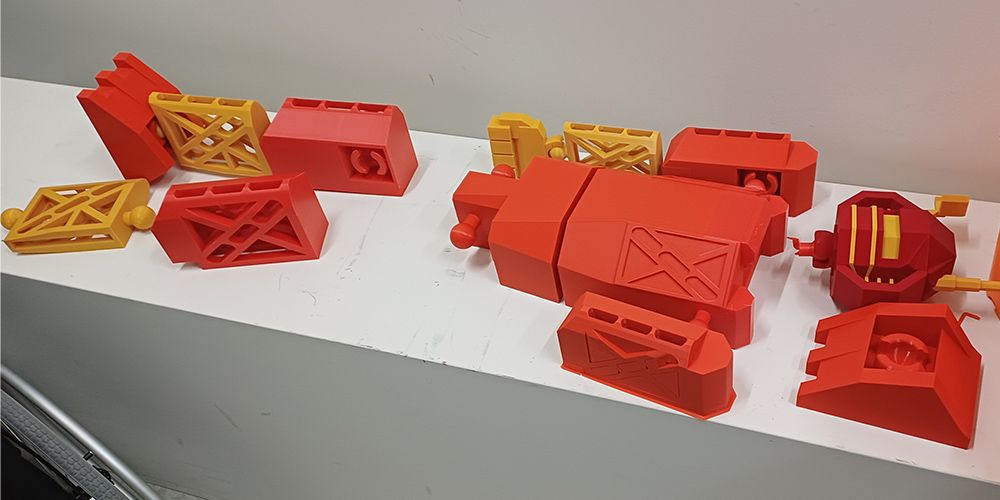 \n\nPieces of a robot printed and ready for assembly\n\n","BodyMaori":null,"Credit":null,"MediaCaption":"This 3D print nearly failed due to filament spools running dangerously low just before completion!","Title":"A large-scale project","TitleMaori":null,"PlayIconStyle":null,"id":430,"Media":{"localFile":{"publicURL":"/static/30b63d7efae25e576aedf10edd728b0f/4_2_main_bc4688cba3.jpg"},"mime":"image/jpeg"},"VideoPlaceholderImage":null}],"Title":"DL01 Community 04 - 3D Nikolai","id":"Slideshows_105","strapiId":105,"TimeoutOverrideSeconds":null}},"pageContext":{"id":"Slideshows_105","slideshowData":{"Slideshow":[{"Body":"Inspired by Gundam and other Japanese mecha, this armoured robot was designed in Tinkercad and printed at Selwyn Libraries. But it wasn’t just made to look cool, it also functions as a bookshelf, with slots designed into its frame. Getting this balance of design and utility took multiple tries. Some early versions couldn’t stand upright, were too large for the display case or broke when assembled, while others lacked the aesthetics I wanted. After lots of tweaking and test prints, the final design came together. None of the material was wasted, used filament from this display and others has been recycled through Kiwifil, our 3D printing recycling partner. \n\n--- \n\n**On display** \n\nBookshelf-powered Armoured Robot, designed and printed by Nikolai Pidwerbesky at Selwyn Libraries.\n","BodyMaori":null,"Credit":null,"MediaCaption":"Designing the robot using Tinkercad","Title":"Nikolai’s Bookshelf Powered Robot","TitleMaori":null,"id":429,"PlayIconStyle":null,"Media":{"localFile":{"publicURL":"/static/51ce353a838dcc100bbc1f37d0c19e62/4_1_main_8231e3b57c.png"},"mime":"image/png"}},{"Body":"This robot represents one of our largest 3D prints, consuming nearly 3 kilograms of filament to achieve. To complete it, teams from across all four Selwyn Libraries branches pitched in to print elements of the project. The print required extensive post-processing to make the pieces fit as intended. While the design looked seamless digitally, in practice the parts didn’t lock together perfectly. Several joints had to be carefully sanded down and adjusted, ensuring stability and alignment so the overall structure was stable and could hold as planned. \n\n \n\nPieces of a robot printed and ready for assembly\n\n","BodyMaori":null,"Credit":null,"MediaCaption":"This 3D print nearly failed due to filament spools running dangerously low just before completion!","Title":"A large-scale project","TitleMaori":null,"id":430,"PlayIconStyle":null,"Media":{"localFile":{"publicURL":"/static/30b63d7efae25e576aedf10edd728b0f/4_2_main_bc4688cba3.jpg"},"mime":"image/jpeg"}}],"Title":"DL01 Community 04 - 3D Nikolai","id":"Slideshows_105","strapiId":105},"homePath":"/touchscreens/DL01","backPath":"/touchscreens/DL01/menu/4","title":"DIGITAL LABEL 01
English","showLanguageButtons":null,"styles":"html,body {\n font-family: Gotham;\n height: 100%;\n margin: 0px;\n padding: 0px;\n}\n\n* {\n -webkit-user-select: none;\n -khtml-user-select: none;\n -moz-user-select: none;\n -o-user-select: none;\n user-select: none;\n}\n\nh1 {\n color: #231f20;\n margin: -20px 0 0 0;\n font-family: 'IndustryIncInline';\n font-size: 80px;\n text-transform: uppercase;\n}\n\nh3 {\n color: #231f20;\n font-size: 12px;\n text-transform: uppercase;\n line-height: 2em;\n}\n\nh3.subpage-touchscreen-title {\n font-family: 'DIN2014';\n font-size: 20px;\n text-transform: uppercase;\n margin-top: -18px;\n}\n\na {\n text-decoration: none;\n}\n\n.menu-page-icon-container h1, .touchscreen-menu-items-container h1 {\n width: 900px;\n min-height: 2em;\n}\n\n.menu-page-icon-container.with-sidebar h1 {\n width: auto !important;\n}\n\n.page-container {\n margin: 0;\n padding: 70px 100px 0;\n position: relative;\n height: 100%;\n background: #ebebeb;\n}\n\nmain {\n width: 1920px;\n height: 1080px;\n}\n\n.hidden {\n display: none;\n}\n\n.nav {\n position: absolute;\n top: 60px;\n left: 0;\n z-index: 999;\n}\n\n.nav div, .nav a {\n display: block;\n width: 80px;\n height: 80px;\n float: left;\n}\n\n.nav .home {\n background: url(\"/SVG/Buttons/btn_home_light.svg\");\n}\n\n.nav .back {\n background: url(\"/SVG/Buttons/btn_arrow_prev.svg\");\n}\n\n.zoom-btn, .zoom-btn-fixed {\n display: block;\n width: 80px;\n height: 80px;\n position: absolute;\n top: 60px;\n right: 0;\n z-index: 999;\n background: url(\"/SVG/Buttons/btn_zoom_light.svg\");\n}\n\n.zoom-btn-fixed {\n right: 576px;\n}\n\n.play-btn {\n display: block;\n width: 80px;\n height: 80px;\n position: absolute;\n top: 50%;\n right: 50%;\n z-index: 999;\n background: url(\"/SVG/Buttons/btn_play.svg\");\n margin-right: -40px;\n margin-top: -40px;\n}\n\n.play-btn-audio {\n display: block;\n width: 80px;\n height: 80px;\n position: absolute;\n z-index: 999;\n background: url(\"/SVG/Buttons/btn_Audio.svg\");\n}\n\n.fancybox-button--close, .fancybox-close-small {\n position: fixed !important;\n width: 80px !important;\n height: 80px !important;\n background: url(\"/SVG/Buttons/btn_close.svg\") !important;\n}\n\n.fancybox-button--close svg, .fancybox-close-small svg {\n display: none !important;\n}\n\n.fancybox-button--zoom {\n display: none !important;\n}\n\n.fancybox-toolbar {\n width: 80px;\n}\n\n.video-js {\n background-color: #212121 !important;\n}\n\n.bg-div {\n background-size: cover !important;\n}\n\n.bg-video {\n position: fixed;\n right: 0;\n bottom: 0;\n min-width: 100%;\n min-height: 100%;\n z-index: 1;\n transition: 1s;\n}\n\n.halfFade {\n opacity: 0.2;\n}\n\n.touchscreen-page {\n background-color: #ebebeb00;\n}\n\n.touchscreen-page .nav {\n opacity: 0;\n transition: 1s;\n}\n\n.fadeIn {\n opacity: 1 !important;\n}\n\n.touchscreen-menu-items-container {\n transition: 1s;\n position: absolute;\n left: 1920px;\n top: 0;\n width: 1920px;\n height: 1080px;\n z-index: 100;\n}\n\n.touchscreen-menu-items-container-slide-in {\n left: 0;\n}\n\n.touchscreen-menu-items {\n z-index: 100;\n position: relative;\n width: 1720px;\n text-align: center;\n}\n\n.touchscreen-menu-items a {\n width: 600px;\n height: 600px;\n max-width: 600px;\n max-height: 600px;\n display: inline-block;\n margin: 90px 4px 0;\n}\n\n.touchscreen-menu-items a img {\n max-width: 600px;\n max-height: 600px;\n filter: grayscale(100%);\n}\n\n.touchscreen-menu-items a p {\n text-transform: uppercase;\n margin: 0;\n font-family: \"DIN2014\";\n width: 600px;\n padding: 10px;\n color: #231f20;\n white-space: nowrap;\n position: absolute;\n bottom: 0px;\n background-color: rgba(208, 210, 211, 0.8);\n height: 50px;\n text-align: left;\n bottom: 3px;\n}\n\n.touchscreen-text {\n transition: 1s;\n position: relative;\n left: 0;\n z-index: 100;\n}\n\n.touchscreen-text-slide-out {\n left: -1920px;\n}\n\n.touchscreen-text h1 {\n font-size: 160px;\n margin: 0;\n}\n\n.touchscreen-text h3 {\n font-size: 32px;\n font-weight: 200;\n padding-left: 20px;\n}\n\n.menu-page-items {\n height: 760px;\n position: relative;\n}\n\n.with-sidebar .menu-page-items {\n height: 870px !important;\n}\n\n.vertical-align {\n/* Center slide text vertically */\n \n\n\n display: -webkit-box;\n display: -ms-flexbox;\n display: -webkit-flex;\n display: flex;\n -webkit-box-pack: center;\n -ms-flex-pack: center;\n -webkit-justify-content: center;\n justify-content: center;\n -webkit-box-align: center;\n -ms-flex-align: center;\n -webkit-align-items: center;\n align-items: center;\n}\n\n.menu-page-infobox {\n display: none;\n}\n\n.menu-page-icon-container {\n color: #fff;\n width: 1820px;\n}\n\n.with-sidebar .menu-page-items-container {\n width: 1244px !important;\n}\n\n.menu-page-sidebar .swiper-zoom-container {\n position: relative;\n}\n\n.menu-page-sidebar .play-btn {\n left: auto !important;\n top: auto !important;\n right: auto !important;\n}\n\n.menu_item {\n position: relative;\n float: left;\n min-height: 1px;\n width: 340px;\n margin: 5px;\n}\n\n.menu_item img {\n filter: sepia(0) grayscale(100%);\n transition: .3s ease-in-out;\n display: block;\n width: 100%;\n max-width: none;\n height: 100%;\n object-fit: cover;\n}\n\n.menu_item p {\n text-transform: uppercase;\n margin: 0;\n font-family: \"DIN2014\";\n width: 100%;\n padding: 10px;\n color: #231f20;\n white-space: nowrap;\n position: absolute;\n bottom: 0;\n background-color: rgba(208, 210, 211, 0.9);\n min-height: 50px;\n}\n\n.menu_item.active p {\n background-color: rgba(255, 255, 255, 0.9);\n}\n\n.menu_item.active img {\n filter: sepia(75%) grayscale(0) !important;\n}\n\n.menu-page-icon-container.with-sidebar .menu_item {\n width: 270px;\n}\n\n.menu-page-icon-container {\n width: auto;\n}\n\n.main-slide {\n width: 100%;\n height: 100%;\n}\n\n.main-slide img {\n max-width: 80% !important;\n max-height: 910px !important;\n box-shadow: 3px 2px 20px 0px rgba(0, 0, 0, 0.2);\n}\n\n.video-fullscreen {\n width: 1820px;\n background: transparent !important;\n}\n\n.swiper-container {\n margin: 0 !important;\n background: rgb(235, 235, 235);\n}\n\n.swiper-main {\n width: 70%;\n height: 88%;\n position: absolute;\n left: 0px;\n top: 0;\n}\n\n.vjs-tech {\n pointer-events: none;\n}\n\n\n\n/* .fancybox-bg {background:lightgrey !important;} */\n\n\n\n.swiper-infobox {\n width: 30%;\n height: 100%;\n position: absolute !important;\n right: 0;\n top: 0;\n}\n\n.swiper-infobox .infobox h3 {\n margin-top: 200px;\n font-size: 32px;\n font-family: \"DIN2014\";\n letter-spacing: 0.1em;\n line-height: 1em;\n}\n\n.swiper-infobox .infobox {\n max-width: 410px;\n margin-left: 30px;\n font-weight: 100;\n}\n\n.swiper-infobox .infobox img {\n width: 100%;\n}\n\n.swiper-infobox .infobox .text {\n height: 590px;\n overflow: auto;\n padding-right: 10px;\n}\n\n.menu-page-sidebar .text {\n height: 860px !important;\n ;\n}\n\n::-webkit-scrollbar {\n width: 5px;\n height: 5px;\n}\n\n::-webkit-scrollbar-track {\n background: rgba(0, 0, 0, 0.1);\n}\n\n::-webkit-scrollbar-thumb {\n background: rgba(0, 0, 0, 0.5);\n}\n\n.swiper-scrollbar {\n height: 6px;\n}\n\n.swiper-caption {\n width: 70%;\n height: 12%;\n position: absolute;\n left: 0px;\n bottom: 0px;\n}\n\n.swiper-caption .caption {\n position: absolute;\n left: 30px;\n top: 10px;\n font-weight: 200;\n text-align: left;\n font-size: 14px;\n max-width: 650px;\n line-height: 1;\n}\n.swiper-caption .credit {\n position: absolute;\n left: 30px;\n top: 60px;\n}\nblockquote, .swiper-caption .credit {\n font-weight: 100;\n ;\n text-align: left;\n font-size: 12px;\n max-width: 650px;\n line-height: 1;\n}\nblockquote {margin: 0 !important;}\n\n.swiper-scrollbar {\n border-radius: 10px;\n position: relative;\n -ms-touch-action: none;\n background: rgba(0, 0, 0, .1);\n}\n\n.swiper-container > .swiper-scrollbar {\n top: 0 !important;\n position: absolute;\n left: 1%;\n bottom: 3px;\n z-index: 50;\n height: 5px;\n width: 98%;\n}\n\n.main-slide {\n text-align: center;\n font-size: 18px;\n background: rgb(235, 235, 235);\n/* Center slide text vertically */\n \n\n\n display: -webkit-box;\n display: -ms-flexbox;\n display: -webkit-flex;\n display: flex;\n -webkit-box-pack: center;\n -ms-flex-pack: center;\n -webkit-justify-content: center;\n justify-content: center;\n -webkit-box-align: center;\n -ms-flex-align: center;\n -webkit-align-items: center;\n align-items: center;\n}\n\n.main-slide .media {\n width: 100%;\n max-height: 910px;\n}\n\n.swiper-button-prev {\n background: url(\"/SVG/Buttons/btn_arrow_prev.svg\");\n left: auto !important;\n right: 81px !important;\n}\n\n.swiper-button-next {\n background: url(\"/SVG/Buttons/btn_arrow_next.svg\");\n right: 0 !important;\n}\n\n.swiper-button-prev, .swiper-button-next {\n width: 80px !important;\n height: 80px !important;\n font-weight: bold;\n position: absolute !important;\n top: 30px !important;\n}\n\n.swiper-button-prev:after, .swiper-button-next:after {\n content: \"\" !important;\n}\n\n.swiper-pagination-fraction {\n font-family: 'IndustryIncInline';\n left: 30px !important;\n bottom: 50px !important;\n text-align: left !important;\n font-size: 50px;\n}\n\n.my-shuffle {\n position: relative;\n overflow: hidden;\n top: 20px;\n/* padding-bottom:100%; */\n \n}\n\n\n/* default styles so shuffle doesn't have to set them (it will if they're missing) */\n.my-shuffle {\n position: relative;\n overflow: hidden;\n}\n\n/* Ensure images take up the same space when they load */\n/* https://vestride.github.io/Shuffle/images */\n.aspect {\n position: relative;\n width: 100%;\n height: 0;\n padding-bottom: 100%;\n overflow: hidden;\n}\n\n.aspect__inner {\n position: absolute;\n top: 0;\n right: 0;\n bottom: 0;\n left: 0;\n}\n\n\n/* img {\n display: block;\n width: 100%;\n max-width: none;\n height: 100%;\n object-fit: cover;\n} */\n\n/* Small reset */\n\n*,\n::before,\n::after {\n box-sizing: border-box;\n}\n\nfigure {\n margin: 0;\n padding: 0;\n}\n\n.menu-page-items-container {\n overflow-x: auto;\n}\n\n.fancybox-toolbar {\n visibility: visible !important;\n opacity: 1.0 !important;\n}\n\nvideo::-webkit-media-controls-overlay-play-button,\nvideo::-webkit-media-controls-volume-slider-container,\nvideo::-webkit-media-controls-mute-button,\nvideo::-webkit-media-controls-volume-slider,\nvideo::-webkit-media-controls-fullscreen-button,\nvideo::-webkit-media-controls-play-button,\nvideo::-webkit-media-controls-pausebutton {\n display: none;\n}\n\n.menu-page-20 .menu_item {\n width: 600px;\n}\n\n\n.menu-page-20 .menu-page-items {\n width: 1500px !important;\n position: absolute;\n top: 275px;\n left: 350px;\n}\n\n.menu-page-23 .menu_item {\n width: 600px;\n}\n\n\n.menu-page-23 .menu-page-items {\n width: 1500px !important;\n position: absolute;\n top: 275px;\n left: 350px;\n}\n\n.menu-page-15 .menu-page-items-container {\n overflow-x: auto;\n position: absolute;\n top: 180px;\n}\n\n.menu-page-19 .menu-page-items-container {\n overflow-x: auto;\n position: absolute;\n top: 180px;\n}\n\n.menu-page-20 .grid-icon-size.without-sidebar, .menu-page-20 .without-sidebar .grid-icon {\n height: 600px;\n width: 600px;\n max-width: 600px;\n}\n\n.menu-page-23 .grid-icon-size.without-sidebar, .menu-page-23 .without-sidebar .grid-icon {\n height: 600px;\n width: 600px;\n max-width: 600px;\n}\n\n.grid-icon-size, .grid-icon {margin-right:10px;margin-top:10px;transition: width 0.5s ease-in-out;overflow:hidden;height:250px;width:250px;max-width:250px;position:relative;float:left;}\n.grid-icon-size.without-sidebar, .without-sidebar .grid-icon {height:250px;width:250px;max-width:250px;}\n.grid-icon-size.with-sidebar, .with-sidebar .grid-icon {height:270px;width:270px;max-width:270px;}\n.grid-icon img {transition: filter 0.5s ease-in-out; filter: sepia(0) grayscale(0%);width:100%;}\n.grid-icon img.highlight {filter: sepia(0) grayscale(100%);}\n.grid-icon p {text-transform: uppercase;margin: 0;font-family: 'DIN2014';width: 100%;padding: 10px;color: #231f20;white-space: nowrap;position: absolute;bottom: 0;background-color: rgba(208, 210, 211, 0.9);min-height: 50px;transition: opacity 0.25s ease-in-out;opacity:1;bottom:0;position:absolute;}\n.grid-icon.hidden-icon {width:0;margin:0;}\n.grid-icon.hidden-icon p {opacity:0;}\nbody {width: 1920px;height: 1080px;overflow: hidden;}\n\n.buttons-language {top:60px;right:0;position:fixed;z-index:99999999;font-size:18pt;}\n.buttons-language a {display:inline-block;width:180px;background-color:#b7b7b7;#color:#000;line-height:80px;text-align:center;}\n.buttons-language a.active {background-color:#000000;color:#cfcfce;}\n\n\n.tags-container {\n position: fixed;\n right: 0;\n top: 0;\n width: 300px;\n height: 100%;\n backgroundColor: #ebebeb; \n}\n\n.with-sidebar .tags-container {\n right: 530px !important;\n}\n\n.tags {\n position: absolute;\n top: 50%;\n left: 50%;\n transform: translate(-50%, -50%);\n color: #231f20;\n margin: 0;\n text-align: right;\n margin-right: 70px;\n}\n\n.tags a {\n font-family: \"DIN2014\";\n text-transform: uppercase;\n line-height: 20px;\n display: block;\n padding: 0 10px;\n margin: 30px 0;\n text-align: center;\n font-size: 15px; \n}\n\n.tags a:last-child {\n margin-right: 0;\n}\n\n.tags a.active {\n border-bottom: 1px solid #231f20;\n}\n\n\n\n/* Tedds rubbish starts here*/\n\n\n.touchscreen-text h1 {\n font-size: 72px;\n color: #ffffff;\n}\n\nh1 {\n color: #231f20;\n margin: -20px 0 0 0;\n font-family: 'Atlas Grotesk';\n font-size: 80px;\n}\n\n.touchscreen-text {\n transition: 1s;\n position: relative;\n left: 0;\n top: 400px;\n z-index: 100;\n}\n.touchscreen-text h3 {\n font-size: 36px;\n font-weight: 300;\n color: white;\n padding-left: 0px;\n position: fixed;\n}\n\nh3 {\n color: #231f20;\n font-size: 12px;\n text-transform: uppercase;\n line-height: 2em;\n font-family: 'Atlas Grotesk';\n}\n\nhtml, body {\n font-family: 'Atlas Grotesk';\n}\n\nh1 {\n color: #231f20;\n margin: 2px 0 0 0;\n font-family: 'Atlas Grotesk';\n font-size: 48px;\n font-weight: 500;\n}\n\n.tags-container {\n position: fixed;\n right: 0;\n top: 0;\n width: 360px;\n height: 100%;\n backgroundColor: #ebebeb;\n}\n\n.tags {\n position: absolute;\n top: 50%;\n left: 50%;\n transform: translate(-50%, -50%);\n color: #231f20;\n margin: 0;\n text-align: right;\n margin-right: 0px;\n}\n\n.swiper-infobox .infobox h3 {\n margin-top: 200px;\n font-size: 32px;\n font-family: \"Atlas Grotesk\";\n letter-spacing: 0.1em;\n line-height: 1em;\n}\n\n.swiper-caption .caption {\n position: absolute;\n left: 30px;\n top: 10px;\n font-weight: 300;\n text-align: left;\n font-size: 14px;\n max-width: 650px;\n line-height: 1;\n}\n\n.swiper-pagination-fraction {\n font-family: 'Atlas Grotesk';\n left: 360px !important;\n bottom: 30px !important;\n text-align: left !important;\n font-size: 80px;\n font-weight: 900;\n color: #00000033;\n}\n\n\n.grid-icon p {\n text-transform: uppercase;\n margin: 0;\n font-family: 'Atlas Grotesk';\n font-size: 14px;\n width: 100%;\n padding: 10px;\n color: #231f20;\n white-space: normal;\n position: absolute;\n bottom: 0;\n background-color: rgba(208, 210, 211, 0.9);\n min-height: 50px;\n transition: opacity 0.25s ease-in-out;\n opacity: 1;\n bottom: 0;\n position: absolute;\n}\n\n.touchscreen-text h1 {\n font-size: 72px;\n display: none;\n color: #ffffff;\n}\n\n.touchscreen-pageDL01 .touchscreen-text h3 {\n font-size: 36px;\n font-weight: 300;\n color: black;\n padding-left: 0px;\n}\n\n.touchscreen-pageDL03 .touchscreen-text h3 {\n font-size: 36px;\n font-weight: 300;\n color: black;\n padding-left: 0px;\n}\n\n\n.menu-page-icon-container h1, .touchscreen-menu-items-container h1 {\n width: 900px;\n min-height: 2em;\n margin-bottom: 60px;\n}\n\n.page-container {\n margin: 0;\n padding: 52px 100px 0;\n position: relative;\n height: 100%;\n background: #ebebeb;\n}\n\n\n\n.menu-page-items-container {\n margin-top: 300px;\n overflow-x: auto;\n width: 1300px !important;\n height: 560px;\n overflow-y: hidden;\n}\n\nh5 {\n font-family: 'Atlas Grotesk';\nfont-weight: 350;\n font-size: 85%;\nmargin-top: 10px;\nmargin-bottom: 10px;\n}\n"}},
"staticQueryHashes": []}