{
"componentChunkName": "component---src-pages-slideshow-js",
"path": "/touchscreens/DL01/slideshow/106",
"result": {"data":{"strapiSlideshows":{"Slideshow":[{"Body":"This display combines two creative tools: Minecraft and a 3D printing pen. The bonsai tree was built in Minecraft Education Edition, exported with a structure block as an .obj file, and then prepared in PrusaSlicer. It was printed on Leeston Library and Service Centre’s Prusa MK3 with the MMU3 upgrade, allowing up to five colours of filament to be used in one print. \n\nThe project faced challenges along the way. Early exports from Minecraft removed key blocks that were needed for stability, which meant the process had to be repeated several times until a usable file was created. Printing in multiple colours also caused problems, with long 16-hour prints shifting layers. The solution was to split the model in two and join it afterwards. \n\n--- \n\n**On display** \n\nMinecraft bonsai tree and potted succulent created by Charlie Hofmeester at Selwyn Libraries. These items are displayed on a wooden stand generously provided by the Rolleston Men’s Shed. \n\n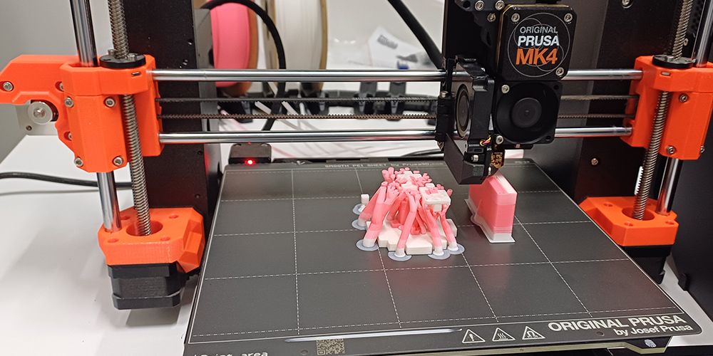\n\n \nA prototype copy of the Minecraft tree printing on the Prusa MK4 with the MMU3 Upgrade\n","BodyMaori":null,"Credit":null,"MediaCaption":"The original version of the tree still inside Minecraft","Title":"Charlie’s Minecraft Bonsai Tree","TitleMaori":null,"PlayIconStyle":null,"id":431,"Media":{"localFile":{"publicURL":"/static/31825b724daaa7a690d17490c6f65e28/5_1_main_ff17097110.jpg"},"mime":"image/jpeg"},"VideoPlaceholderImage":null},{"Body":"The succulent was made using a stencil from the 3Doodler website. I traced each leaf with the 3D printing pen, then welded them together and placed them in a 3D-printed pot to create the final complete plant. \n\nThe process required significant refinement to get a clean result. Because the leaves were traced directly from paper stencils, small fragments of paper became stuck to the surface during construction. These were then sanded away by hand, then improved further by being soaked in warm water to soften and remove any remaining residue. The result was a more polished handmade model that highlights the versatility of 3D printing pens. \n\n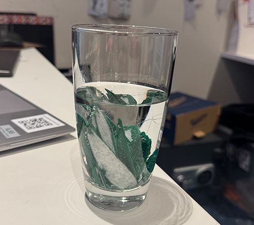\n\n \nLeaves being soaked in water to remove excess residue\n","BodyMaori":null,"Credit":null,"MediaCaption":"Traditional crafting meets modern 3D printing","Title":"Making the leaves","TitleMaori":null,"PlayIconStyle":null,"id":432,"Media":{"localFile":{"publicURL":"/static/68afaeb35472d3500de2e9f48c219b9f/5_2_main_b68f2eb330.jpg"},"mime":"image/jpeg"},"VideoPlaceholderImage":null},{"Body":"This image shows Charlie arranging the finished 3D prints inside the display case, the final steps in preparing the exhibition. Objects were carefully placed to ensure that every piece can be clearly seen and appreciated. Hopefully everyone will enjoy this display which was created to inspire creativity and discovery amongst Tamariki. ","BodyMaori":null,"Credit":null,"MediaCaption":"Charlie making final touches to the display","Title":"Finishing touches","TitleMaori":null,"PlayIconStyle":null,"id":433,"Media":{"localFile":{"publicURL":"/static/01bad43c5d27a97f20da088cac1db1a8/5_3_main_39b4c327d3.jpg"},"mime":"image/jpeg"},"VideoPlaceholderImage":null}],"Title":"DL01 Community 05 - 3D Charlie","id":"Slideshows_106","strapiId":106,"TimeoutOverrideSeconds":null}},"pageContext":{"id":"Slideshows_106","slideshowData":{"Slideshow":[{"Body":"This display combines two creative tools: Minecraft and a 3D printing pen. The bonsai tree was built in Minecraft Education Edition, exported with a structure block as an .obj file, and then prepared in PrusaSlicer. It was printed on Leeston Library and Service Centre’s Prusa MK3 with the MMU3 upgrade, allowing up to five colours of filament to be used in one print. \n\nThe project faced challenges along the way. Early exports from Minecraft removed key blocks that were needed for stability, which meant the process had to be repeated several times until a usable file was created. Printing in multiple colours also caused problems, with long 16-hour prints shifting layers. The solution was to split the model in two and join it afterwards. \n\n--- \n\n**On display** \n\nMinecraft bonsai tree and potted succulent created by Charlie Hofmeester at Selwyn Libraries. These items are displayed on a wooden stand generously provided by the Rolleston Men’s Shed. \n\n\n\n \nA prototype copy of the Minecraft tree printing on the Prusa MK4 with the MMU3 Upgrade\n","BodyMaori":null,"Credit":null,"MediaCaption":"The original version of the tree still inside Minecraft","Title":"Charlie’s Minecraft Bonsai Tree","TitleMaori":null,"id":431,"PlayIconStyle":null,"Media":{"localFile":{"publicURL":"/static/31825b724daaa7a690d17490c6f65e28/5_1_main_ff17097110.jpg"},"mime":"image/jpeg"}},{"Body":"The succulent was made using a stencil from the 3Doodler website. I traced each leaf with the 3D printing pen, then welded them together and placed them in a 3D-printed pot to create the final complete plant. \n\nThe process required significant refinement to get a clean result. Because the leaves were traced directly from paper stencils, small fragments of paper became stuck to the surface during construction. These were then sanded away by hand, then improved further by being soaked in warm water to soften and remove any remaining residue. The result was a more polished handmade model that highlights the versatility of 3D printing pens. \n\n\n\n \nLeaves being soaked in water to remove excess residue\n","BodyMaori":null,"Credit":null,"MediaCaption":"Traditional crafting meets modern 3D printing","Title":"Making the leaves","TitleMaori":null,"id":432,"PlayIconStyle":null,"Media":{"localFile":{"publicURL":"/static/68afaeb35472d3500de2e9f48c219b9f/5_2_main_b68f2eb330.jpg"},"mime":"image/jpeg"}},{"Body":"This image shows Charlie arranging the finished 3D prints inside the display case, the final steps in preparing the exhibition. Objects were carefully placed to ensure that every piece can be clearly seen and appreciated. Hopefully everyone will enjoy this display which was created to inspire creativity and discovery amongst Tamariki. ","BodyMaori":null,"Credit":null,"MediaCaption":"Charlie making final touches to the display","Title":"Finishing touches","TitleMaori":null,"id":433,"PlayIconStyle":null,"Media":{"localFile":{"publicURL":"/static/01bad43c5d27a97f20da088cac1db1a8/5_3_main_39b4c327d3.jpg"},"mime":"image/jpeg"}}],"Title":"DL01 Community 05 - 3D Charlie","id":"Slideshows_106","strapiId":106},"homePath":"/touchscreens/DL01","backPath":"/touchscreens/DL01/menu/4","title":"DIGITAL LABEL 01
English","showLanguageButtons":null,"styles":"html,body {\n font-family: Gotham;\n height: 100%;\n margin: 0px;\n padding: 0px;\n}\n\n* {\n -webkit-user-select: none;\n -khtml-user-select: none;\n -moz-user-select: none;\n -o-user-select: none;\n user-select: none;\n}\n\nh1 {\n color: #231f20;\n margin: -20px 0 0 0;\n font-family: 'IndustryIncInline';\n font-size: 80px;\n text-transform: uppercase;\n}\n\nh3 {\n color: #231f20;\n font-size: 12px;\n text-transform: uppercase;\n line-height: 2em;\n}\n\nh3.subpage-touchscreen-title {\n font-family: 'DIN2014';\n font-size: 20px;\n text-transform: uppercase;\n margin-top: -18px;\n}\n\na {\n text-decoration: none;\n}\n\n.menu-page-icon-container h1, .touchscreen-menu-items-container h1 {\n width: 900px;\n min-height: 2em;\n}\n\n.menu-page-icon-container.with-sidebar h1 {\n width: auto !important;\n}\n\n.page-container {\n margin: 0;\n padding: 70px 100px 0;\n position: relative;\n height: 100%;\n background: #ebebeb;\n}\n\nmain {\n width: 1920px;\n height: 1080px;\n}\n\n.hidden {\n display: none;\n}\n\n.nav {\n position: absolute;\n top: 60px;\n left: 0;\n z-index: 999;\n}\n\n.nav div, .nav a {\n display: block;\n width: 80px;\n height: 80px;\n float: left;\n}\n\n.nav .home {\n background: url(\"/SVG/Buttons/btn_home_light.svg\");\n}\n\n.nav .back {\n background: url(\"/SVG/Buttons/btn_arrow_prev.svg\");\n}\n\n.zoom-btn, .zoom-btn-fixed {\n display: block;\n width: 80px;\n height: 80px;\n position: absolute;\n top: 60px;\n right: 0;\n z-index: 999;\n background: url(\"/SVG/Buttons/btn_zoom_light.svg\");\n}\n\n.zoom-btn-fixed {\n right: 576px;\n}\n\n.play-btn {\n display: block;\n width: 80px;\n height: 80px;\n position: absolute;\n top: 50%;\n right: 50%;\n z-index: 999;\n background: url(\"/SVG/Buttons/btn_play.svg\");\n margin-right: -40px;\n margin-top: -40px;\n}\n\n.play-btn-audio {\n display: block;\n width: 80px;\n height: 80px;\n position: absolute;\n z-index: 999;\n background: url(\"/SVG/Buttons/btn_Audio.svg\");\n}\n\n.fancybox-button--close, .fancybox-close-small {\n position: fixed !important;\n width: 80px !important;\n height: 80px !important;\n background: url(\"/SVG/Buttons/btn_close.svg\") !important;\n}\n\n.fancybox-button--close svg, .fancybox-close-small svg {\n display: none !important;\n}\n\n.fancybox-button--zoom {\n display: none !important;\n}\n\n.fancybox-toolbar {\n width: 80px;\n}\n\n.video-js {\n background-color: #212121 !important;\n}\n\n.bg-div {\n background-size: cover !important;\n}\n\n.bg-video {\n position: fixed;\n right: 0;\n bottom: 0;\n min-width: 100%;\n min-height: 100%;\n z-index: 1;\n transition: 1s;\n}\n\n.halfFade {\n opacity: 0.2;\n}\n\n.touchscreen-page {\n background-color: #ebebeb00;\n}\n\n.touchscreen-page .nav {\n opacity: 0;\n transition: 1s;\n}\n\n.fadeIn {\n opacity: 1 !important;\n}\n\n.touchscreen-menu-items-container {\n transition: 1s;\n position: absolute;\n left: 1920px;\n top: 0;\n width: 1920px;\n height: 1080px;\n z-index: 100;\n}\n\n.touchscreen-menu-items-container-slide-in {\n left: 0;\n}\n\n.touchscreen-menu-items {\n z-index: 100;\n position: relative;\n width: 1720px;\n text-align: center;\n}\n\n.touchscreen-menu-items a {\n width: 600px;\n height: 600px;\n max-width: 600px;\n max-height: 600px;\n display: inline-block;\n margin: 90px 4px 0;\n}\n\n.touchscreen-menu-items a img {\n max-width: 600px;\n max-height: 600px;\n filter: grayscale(100%);\n}\n\n.touchscreen-menu-items a p {\n text-transform: uppercase;\n margin: 0;\n font-family: \"DIN2014\";\n width: 600px;\n padding: 10px;\n color: #231f20;\n white-space: nowrap;\n position: absolute;\n bottom: 0px;\n background-color: rgba(208, 210, 211, 0.8);\n height: 50px;\n text-align: left;\n bottom: 3px;\n}\n\n.touchscreen-text {\n transition: 1s;\n position: relative;\n left: 0;\n z-index: 100;\n}\n\n.touchscreen-text-slide-out {\n left: -1920px;\n}\n\n.touchscreen-text h1 {\n font-size: 160px;\n margin: 0;\n}\n\n.touchscreen-text h3 {\n font-size: 32px;\n font-weight: 200;\n padding-left: 20px;\n}\n\n.menu-page-items {\n height: 760px;\n position: relative;\n}\n\n.with-sidebar .menu-page-items {\n height: 870px !important;\n}\n\n.vertical-align {\n/* Center slide text vertically */\n \n\n\n display: -webkit-box;\n display: -ms-flexbox;\n display: -webkit-flex;\n display: flex;\n -webkit-box-pack: center;\n -ms-flex-pack: center;\n -webkit-justify-content: center;\n justify-content: center;\n -webkit-box-align: center;\n -ms-flex-align: center;\n -webkit-align-items: center;\n align-items: center;\n}\n\n.menu-page-infobox {\n display: none;\n}\n\n.menu-page-icon-container {\n color: #fff;\n width: 1820px;\n}\n\n.with-sidebar .menu-page-items-container {\n width: 1244px !important;\n}\n\n.menu-page-sidebar .swiper-zoom-container {\n position: relative;\n}\n\n.menu-page-sidebar .play-btn {\n left: auto !important;\n top: auto !important;\n right: auto !important;\n}\n\n.menu_item {\n position: relative;\n float: left;\n min-height: 1px;\n width: 340px;\n margin: 5px;\n}\n\n.menu_item img {\n filter: sepia(0) grayscale(100%);\n transition: .3s ease-in-out;\n display: block;\n width: 100%;\n max-width: none;\n height: 100%;\n object-fit: cover;\n}\n\n.menu_item p {\n text-transform: uppercase;\n margin: 0;\n font-family: \"DIN2014\";\n width: 100%;\n padding: 10px;\n color: #231f20;\n white-space: nowrap;\n position: absolute;\n bottom: 0;\n background-color: rgba(208, 210, 211, 0.9);\n min-height: 50px;\n}\n\n.menu_item.active p {\n background-color: rgba(255, 255, 255, 0.9);\n}\n\n.menu_item.active img {\n filter: sepia(75%) grayscale(0) !important;\n}\n\n.menu-page-icon-container.with-sidebar .menu_item {\n width: 270px;\n}\n\n.menu-page-icon-container {\n width: auto;\n}\n\n.main-slide {\n width: 100%;\n height: 100%;\n}\n\n.main-slide img {\n max-width: 80% !important;\n max-height: 910px !important;\n box-shadow: 3px 2px 20px 0px rgba(0, 0, 0, 0.2);\n}\n\n.video-fullscreen {\n width: 1820px;\n background: transparent !important;\n}\n\n.swiper-container {\n margin: 0 !important;\n background: rgb(235, 235, 235);\n}\n\n.swiper-main {\n width: 70%;\n height: 88%;\n position: absolute;\n left: 0px;\n top: 0;\n}\n\n.vjs-tech {\n pointer-events: none;\n}\n\n\n\n/* .fancybox-bg {background:lightgrey !important;} */\n\n\n\n.swiper-infobox {\n width: 30%;\n height: 100%;\n position: absolute !important;\n right: 0;\n top: 0;\n}\n\n.swiper-infobox .infobox h3 {\n margin-top: 200px;\n font-size: 32px;\n font-family: \"DIN2014\";\n letter-spacing: 0.1em;\n line-height: 1em;\n}\n\n.swiper-infobox .infobox {\n max-width: 410px;\n margin-left: 30px;\n font-weight: 100;\n}\n\n.swiper-infobox .infobox img {\n width: 100%;\n}\n\n.swiper-infobox .infobox .text {\n height: 590px;\n overflow: auto;\n padding-right: 10px;\n}\n\n.menu-page-sidebar .text {\n height: 860px !important;\n ;\n}\n\n::-webkit-scrollbar {\n width: 5px;\n height: 5px;\n}\n\n::-webkit-scrollbar-track {\n background: rgba(0, 0, 0, 0.1);\n}\n\n::-webkit-scrollbar-thumb {\n background: rgba(0, 0, 0, 0.5);\n}\n\n.swiper-scrollbar {\n height: 6px;\n}\n\n.swiper-caption {\n width: 70%;\n height: 12%;\n position: absolute;\n left: 0px;\n bottom: 0px;\n}\n\n.swiper-caption .caption {\n position: absolute;\n left: 30px;\n top: 10px;\n font-weight: 200;\n text-align: left;\n font-size: 14px;\n max-width: 650px;\n line-height: 1;\n}\n.swiper-caption .credit {\n position: absolute;\n left: 30px;\n top: 60px;\n}\nblockquote, .swiper-caption .credit {\n font-weight: 100;\n ;\n text-align: left;\n font-size: 12px;\n max-width: 650px;\n line-height: 1;\n}\nblockquote {margin: 0 !important;}\n\n.swiper-scrollbar {\n border-radius: 10px;\n position: relative;\n -ms-touch-action: none;\n background: rgba(0, 0, 0, .1);\n}\n\n.swiper-container > .swiper-scrollbar {\n top: 0 !important;\n position: absolute;\n left: 1%;\n bottom: 3px;\n z-index: 50;\n height: 5px;\n width: 98%;\n}\n\n.main-slide {\n text-align: center;\n font-size: 18px;\n background: rgb(235, 235, 235);\n/* Center slide text vertically */\n \n\n\n display: -webkit-box;\n display: -ms-flexbox;\n display: -webkit-flex;\n display: flex;\n -webkit-box-pack: center;\n -ms-flex-pack: center;\n -webkit-justify-content: center;\n justify-content: center;\n -webkit-box-align: center;\n -ms-flex-align: center;\n -webkit-align-items: center;\n align-items: center;\n}\n\n.main-slide .media {\n width: 100%;\n max-height: 910px;\n}\n\n.swiper-button-prev {\n background: url(\"/SVG/Buttons/btn_arrow_prev.svg\");\n left: auto !important;\n right: 81px !important;\n}\n\n.swiper-button-next {\n background: url(\"/SVG/Buttons/btn_arrow_next.svg\");\n right: 0 !important;\n}\n\n.swiper-button-prev, .swiper-button-next {\n width: 80px !important;\n height: 80px !important;\n font-weight: bold;\n position: absolute !important;\n top: 30px !important;\n}\n\n.swiper-button-prev:after, .swiper-button-next:after {\n content: \"\" !important;\n}\n\n.swiper-pagination-fraction {\n font-family: 'IndustryIncInline';\n left: 30px !important;\n bottom: 50px !important;\n text-align: left !important;\n font-size: 50px;\n}\n\n.my-shuffle {\n position: relative;\n overflow: hidden;\n top: 20px;\n/* padding-bottom:100%; */\n \n}\n\n\n/* default styles so shuffle doesn't have to set them (it will if they're missing) */\n.my-shuffle {\n position: relative;\n overflow: hidden;\n}\n\n/* Ensure images take up the same space when they load */\n/* https://vestride.github.io/Shuffle/images */\n.aspect {\n position: relative;\n width: 100%;\n height: 0;\n padding-bottom: 100%;\n overflow: hidden;\n}\n\n.aspect__inner {\n position: absolute;\n top: 0;\n right: 0;\n bottom: 0;\n left: 0;\n}\n\n\n/* img {\n display: block;\n width: 100%;\n max-width: none;\n height: 100%;\n object-fit: cover;\n} */\n\n/* Small reset */\n\n*,\n::before,\n::after {\n box-sizing: border-box;\n}\n\nfigure {\n margin: 0;\n padding: 0;\n}\n\n.menu-page-items-container {\n overflow-x: auto;\n}\n\n.fancybox-toolbar {\n visibility: visible !important;\n opacity: 1.0 !important;\n}\n\nvideo::-webkit-media-controls-overlay-play-button,\nvideo::-webkit-media-controls-volume-slider-container,\nvideo::-webkit-media-controls-mute-button,\nvideo::-webkit-media-controls-volume-slider,\nvideo::-webkit-media-controls-fullscreen-button,\nvideo::-webkit-media-controls-play-button,\nvideo::-webkit-media-controls-pausebutton {\n display: none;\n}\n\n.menu-page-20 .menu_item {\n width: 600px;\n}\n\n\n.menu-page-20 .menu-page-items {\n width: 1500px !important;\n position: absolute;\n top: 275px;\n left: 350px;\n}\n\n.menu-page-23 .menu_item {\n width: 600px;\n}\n\n\n.menu-page-23 .menu-page-items {\n width: 1500px !important;\n position: absolute;\n top: 275px;\n left: 350px;\n}\n\n.menu-page-15 .menu-page-items-container {\n overflow-x: auto;\n position: absolute;\n top: 180px;\n}\n\n.menu-page-19 .menu-page-items-container {\n overflow-x: auto;\n position: absolute;\n top: 180px;\n}\n\n.menu-page-20 .grid-icon-size.without-sidebar, .menu-page-20 .without-sidebar .grid-icon {\n height: 600px;\n width: 600px;\n max-width: 600px;\n}\n\n.menu-page-23 .grid-icon-size.without-sidebar, .menu-page-23 .without-sidebar .grid-icon {\n height: 600px;\n width: 600px;\n max-width: 600px;\n}\n\n.grid-icon-size, .grid-icon {margin-right:10px;margin-top:10px;transition: width 0.5s ease-in-out;overflow:hidden;height:250px;width:250px;max-width:250px;position:relative;float:left;}\n.grid-icon-size.without-sidebar, .without-sidebar .grid-icon {height:250px;width:250px;max-width:250px;}\n.grid-icon-size.with-sidebar, .with-sidebar .grid-icon {height:270px;width:270px;max-width:270px;}\n.grid-icon img {transition: filter 0.5s ease-in-out; filter: sepia(0) grayscale(0%);width:100%;}\n.grid-icon img.highlight {filter: sepia(0) grayscale(100%);}\n.grid-icon p {text-transform: uppercase;margin: 0;font-family: 'DIN2014';width: 100%;padding: 10px;color: #231f20;white-space: nowrap;position: absolute;bottom: 0;background-color: rgba(208, 210, 211, 0.9);min-height: 50px;transition: opacity 0.25s ease-in-out;opacity:1;bottom:0;position:absolute;}\n.grid-icon.hidden-icon {width:0;margin:0;}\n.grid-icon.hidden-icon p {opacity:0;}\nbody {width: 1920px;height: 1080px;overflow: hidden;}\n\n.buttons-language {top:60px;right:0;position:fixed;z-index:99999999;font-size:18pt;}\n.buttons-language a {display:inline-block;width:180px;background-color:#b7b7b7;#color:#000;line-height:80px;text-align:center;}\n.buttons-language a.active {background-color:#000000;color:#cfcfce;}\n\n\n.tags-container {\n position: fixed;\n right: 0;\n top: 0;\n width: 300px;\n height: 100%;\n backgroundColor: #ebebeb; \n}\n\n.with-sidebar .tags-container {\n right: 530px !important;\n}\n\n.tags {\n position: absolute;\n top: 50%;\n left: 50%;\n transform: translate(-50%, -50%);\n color: #231f20;\n margin: 0;\n text-align: right;\n margin-right: 70px;\n}\n\n.tags a {\n font-family: \"DIN2014\";\n text-transform: uppercase;\n line-height: 20px;\n display: block;\n padding: 0 10px;\n margin: 30px 0;\n text-align: center;\n font-size: 15px; \n}\n\n.tags a:last-child {\n margin-right: 0;\n}\n\n.tags a.active {\n border-bottom: 1px solid #231f20;\n}\n\n\n\n/* Tedds rubbish starts here*/\n\n\n.touchscreen-text h1 {\n font-size: 72px;\n color: #ffffff;\n}\n\nh1 {\n color: #231f20;\n margin: -20px 0 0 0;\n font-family: 'Atlas Grotesk';\n font-size: 80px;\n}\n\n.touchscreen-text {\n transition: 1s;\n position: relative;\n left: 0;\n top: 400px;\n z-index: 100;\n}\n.touchscreen-text h3 {\n font-size: 36px;\n font-weight: 300;\n color: white;\n padding-left: 0px;\n position: fixed;\n}\n\nh3 {\n color: #231f20;\n font-size: 12px;\n text-transform: uppercase;\n line-height: 2em;\n font-family: 'Atlas Grotesk';\n}\n\nhtml, body {\n font-family: 'Atlas Grotesk';\n}\n\nh1 {\n color: #231f20;\n margin: 2px 0 0 0;\n font-family: 'Atlas Grotesk';\n font-size: 48px;\n font-weight: 500;\n}\n\n.tags-container {\n position: fixed;\n right: 0;\n top: 0;\n width: 360px;\n height: 100%;\n backgroundColor: #ebebeb;\n}\n\n.tags {\n position: absolute;\n top: 50%;\n left: 50%;\n transform: translate(-50%, -50%);\n color: #231f20;\n margin: 0;\n text-align: right;\n margin-right: 0px;\n}\n\n.swiper-infobox .infobox h3 {\n margin-top: 200px;\n font-size: 32px;\n font-family: \"Atlas Grotesk\";\n letter-spacing: 0.1em;\n line-height: 1em;\n}\n\n.swiper-caption .caption {\n position: absolute;\n left: 30px;\n top: 10px;\n font-weight: 300;\n text-align: left;\n font-size: 14px;\n max-width: 650px;\n line-height: 1;\n}\n\n.swiper-pagination-fraction {\n font-family: 'Atlas Grotesk';\n left: 360px !important;\n bottom: 30px !important;\n text-align: left !important;\n font-size: 80px;\n font-weight: 900;\n color: #00000033;\n}\n\n\n.grid-icon p {\n text-transform: uppercase;\n margin: 0;\n font-family: 'Atlas Grotesk';\n font-size: 14px;\n width: 100%;\n padding: 10px;\n color: #231f20;\n white-space: normal;\n position: absolute;\n bottom: 0;\n background-color: rgba(208, 210, 211, 0.9);\n min-height: 50px;\n transition: opacity 0.25s ease-in-out;\n opacity: 1;\n bottom: 0;\n position: absolute;\n}\n\n.touchscreen-text h1 {\n font-size: 72px;\n display: none;\n color: #ffffff;\n}\n\n.touchscreen-pageDL01 .touchscreen-text h3 {\n font-size: 36px;\n font-weight: 300;\n color: black;\n padding-left: 0px;\n}\n\n.touchscreen-pageDL03 .touchscreen-text h3 {\n font-size: 36px;\n font-weight: 300;\n color: black;\n padding-left: 0px;\n}\n\n\n.menu-page-icon-container h1, .touchscreen-menu-items-container h1 {\n width: 900px;\n min-height: 2em;\n margin-bottom: 60px;\n}\n\n.page-container {\n margin: 0;\n padding: 52px 100px 0;\n position: relative;\n height: 100%;\n background: #ebebeb;\n}\n\n\n\n.menu-page-items-container {\n margin-top: 300px;\n overflow-x: auto;\n width: 1300px !important;\n height: 560px;\n overflow-y: hidden;\n}\n\nh5 {\n font-family: 'Atlas Grotesk';\nfont-weight: 350;\n font-size: 85%;\nmargin-top: 10px;\nmargin-bottom: 10px;\n}\n"}},
"staticQueryHashes": []}