{
"componentChunkName": "component---src-pages-slideshow-js",
"path": "/touchscreens/DL04/slideshow/108",
"result": {"data":{"strapiSlideshows":{"Slideshow":[{"Body":"Rolleston Men’s Shed - one of three in Selwyn - is a hive of activity on Dynes Road, providing mateship and support for local men through shared projects and community service. As Rolleston’s own ‘Repair Shop’, members fix all manner of things in well-resourced wood and metal workshops. They also make new items for the community, including local charities and sports clubs. As a public service, members work with families to re-home tools and shed equipment. Valuable construction and IT skills are shared and handed down, and health education is provided at the all-important ‘smoko’, over a cuppa and a biscuit! \n\n“Men’s sheds are places where things are made and problems are solved.” – James Sutherland, 2013 \n\n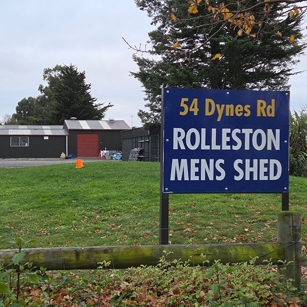 \n\nEstablished in 2013, the Rolleston Men’s Shed occupied two temporary premises, before moving to a permanent home at 54 Dynes Road. This purpose-built facility was opened by Selwyn Mayor Kelvin Coe on 23 September 2016. \n>Michelle Sim\n\n","BodyMaori":null,"Credit":"Rolleston Men’s Shed","MediaCaption":"Some of the 80 Rolleston Men’s Shed members, December 2024. ","Title":"Rolleston’s own Repair Shop","TitleMaori":null,"PlayIconStyle":null,"id":439,"Media":{"localFile":{"publicURL":"/static/910dd6e39247ef93801cc6de83377bba/Rolleston_Men_s_Shed_slide_1_main_c1fa891f02.JPG"},"mime":"image/jpeg"},"VideoPlaceholderImage":null},{"Body":"This selection of items was chosen to showcase the remarkable range of materials, techniques and skills at Rolleston Men’s Shed. The copper, aluminium and glass shelving system in this case was designed and manufactured by the Rolleston Men’s Shed, to demonstrate working with two different metals. \n\n**Shelf 1:** Set of six laser-engraved wooden coasters of native birds, laser-cut coaster with Rolleston Men’s Shed logo, Oamaru stone koru sculpture, silver beech word-turned bowl. \n\n**Shelf 2:** Wood-turned pens on 3D-printed stands, metal mallet with wooden handle, owl made of recycled metal tools, lathe and milling machine sample rod, metal lathe square screw example, black 3D-printed pipe reducer. \n\n**Shelf 3:** Yew pear with copper leaf and stalk, toy car made from recycled wood from a 100 –year-old shearing shed, copper wire tricycle, wood-turned kiwi, flat-pack reindeer made with a CNC router. \n\n**Shelf 4:** Wooden insect house, wooden tanker truck, copper hosta leaf, dancing circle sculpture model, laminated mixed wood bread board, two plasma-cut hand saws (back). \n\n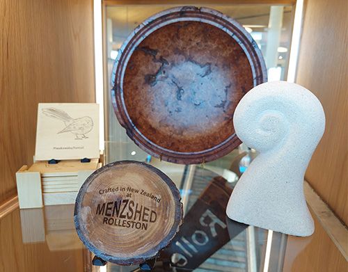 \n \n\nItems on loan from Rolleston Men’s Shed.","BodyMaori":null,"Credit":"Michelle Sim","MediaCaption":"Murray Bradley, Chair of Rolleston Men’s Shed, with the completed case display, 2025.","Title":"What’s in the case?","TitleMaori":null,"PlayIconStyle":null,"id":440,"Media":{"localFile":{"publicURL":"/static/b32af755a0cc172bfa72442d7f97c55f/Rolleston_Men_s_Shed_slide_2_main_2_c30b63c758.JPG"},"mime":"image/jpeg"},"VideoPlaceholderImage":null},{"Body":"The set of 21 joyful sculptures across Rolleston, collectively known as The Dancing Circle, was manufactured by Dave Kerr at the Men’s Shed. \n\nLed by teacher Jade Bell, Year 2 learners at Te Ahi Kaikōmako Rolleston School in 2012 created art depicting a circle of children dancing. Eight years later, they were made into sculptural figures using steel tubing powder-coated in a range of colours, sponsored by several local businesses. \n\nThe children intend for people to interact with their sculptures, play around them and ‘copy the moves.’ Each sculpture was designed to have a polished stainless-steel face, a mirror, so that while people are interacting with the sculptures, the mirror will allow them to become part of the sculpture. \n\n","BodyMaori":null,"Credit":"Selwyn District Council","MediaCaption":"Jade Bell and three former Te Ahi Kaikōmako Rolleston School students, with the first member of The Dancing Circle, 2020. \n","Title":"The Dancing Circle","TitleMaori":null,"PlayIconStyle":null,"id":441,"Media":{"localFile":{"publicURL":"/static/a39e912af4b95c5f941bec5eb96e4bf3/Rolleston_Men_s_Shed_slide_3_main_42607cdc9c.JPG"},"mime":"image/jpeg"},"VideoPlaceholderImage":null}],"Title":"Rolleston Men’s Shed ","id":"Slideshows_108","strapiId":108,"TimeoutOverrideSeconds":null}},"pageContext":{"id":"Slideshows_108","slideshowData":{"Slideshow":[{"Body":"Rolleston Men’s Shed - one of three in Selwyn - is a hive of activity on Dynes Road, providing mateship and support for local men through shared projects and community service. As Rolleston’s own ‘Repair Shop’, members fix all manner of things in well-resourced wood and metal workshops. They also make new items for the community, including local charities and sports clubs. As a public service, members work with families to re-home tools and shed equipment. Valuable construction and IT skills are shared and handed down, and health education is provided at the all-important ‘smoko’, over a cuppa and a biscuit! \n\n“Men’s sheds are places where things are made and problems are solved.” – James Sutherland, 2013 \n\n \n\nEstablished in 2013, the Rolleston Men’s Shed occupied two temporary premises, before moving to a permanent home at 54 Dynes Road. This purpose-built facility was opened by Selwyn Mayor Kelvin Coe on 23 September 2016. \n>Michelle Sim\n\n","BodyMaori":null,"Credit":"Rolleston Men’s Shed","MediaCaption":"Some of the 80 Rolleston Men’s Shed members, December 2024. ","Title":"Rolleston’s own Repair Shop","TitleMaori":null,"id":439,"PlayIconStyle":null,"Media":{"localFile":{"publicURL":"/static/910dd6e39247ef93801cc6de83377bba/Rolleston_Men_s_Shed_slide_1_main_c1fa891f02.JPG"},"mime":"image/jpeg"}},{"Body":"This selection of items was chosen to showcase the remarkable range of materials, techniques and skills at Rolleston Men’s Shed. The copper, aluminium and glass shelving system in this case was designed and manufactured by the Rolleston Men’s Shed, to demonstrate working with two different metals. \n\n**Shelf 1:** Set of six laser-engraved wooden coasters of native birds, laser-cut coaster with Rolleston Men’s Shed logo, Oamaru stone koru sculpture, silver beech word-turned bowl. \n\n**Shelf 2:** Wood-turned pens on 3D-printed stands, metal mallet with wooden handle, owl made of recycled metal tools, lathe and milling machine sample rod, metal lathe square screw example, black 3D-printed pipe reducer. \n\n**Shelf 3:** Yew pear with copper leaf and stalk, toy car made from recycled wood from a 100 –year-old shearing shed, copper wire tricycle, wood-turned kiwi, flat-pack reindeer made with a CNC router. \n\n**Shelf 4:** Wooden insect house, wooden tanker truck, copper hosta leaf, dancing circle sculpture model, laminated mixed wood bread board, two plasma-cut hand saws (back). \n\n \n \n\nItems on loan from Rolleston Men’s Shed.","BodyMaori":null,"Credit":"Michelle Sim","MediaCaption":"Murray Bradley, Chair of Rolleston Men’s Shed, with the completed case display, 2025.","Title":"What’s in the case?","TitleMaori":null,"id":440,"PlayIconStyle":null,"Media":{"localFile":{"publicURL":"/static/b32af755a0cc172bfa72442d7f97c55f/Rolleston_Men_s_Shed_slide_2_main_2_c30b63c758.JPG"},"mime":"image/jpeg"}},{"Body":"The set of 21 joyful sculptures across Rolleston, collectively known as The Dancing Circle, was manufactured by Dave Kerr at the Men’s Shed. \n\nLed by teacher Jade Bell, Year 2 learners at Te Ahi Kaikōmako Rolleston School in 2012 created art depicting a circle of children dancing. Eight years later, they were made into sculptural figures using steel tubing powder-coated in a range of colours, sponsored by several local businesses. \n\nThe children intend for people to interact with their sculptures, play around them and ‘copy the moves.’ Each sculpture was designed to have a polished stainless-steel face, a mirror, so that while people are interacting with the sculptures, the mirror will allow them to become part of the sculpture. \n\n","BodyMaori":null,"Credit":"Selwyn District Council","MediaCaption":"Jade Bell and three former Te Ahi Kaikōmako Rolleston School students, with the first member of The Dancing Circle, 2020. \n","Title":"The Dancing Circle","TitleMaori":null,"id":441,"PlayIconStyle":null,"Media":{"localFile":{"publicURL":"/static/a39e912af4b95c5f941bec5eb96e4bf3/Rolleston_Men_s_Shed_slide_3_main_42607cdc9c.JPG"},"mime":"image/jpeg"}}],"Title":"Rolleston Men’s Shed ","id":"Slideshows_108","strapiId":108},"homePath":"/touchscreens/DL04","backPath":"/touchscreens/DL04/menu/29","title":"DIGITAL LABEL 04
Digital Label Title 04","showLanguageButtons":null,"styles":"html,body {\n font-family: Gotham;\n height: 100%;\n margin: 0px;\n padding: 0px;\n}\n\n* {\n -webkit-user-select: none;\n -khtml-user-select: none;\n -moz-user-select: none;\n -o-user-select: none;\n user-select: none;\n}\n\nh1 {\n color: #231f20;\n margin: -20px 0 0 0;\n font-family: 'IndustryIncInline';\n font-size: 80px;\n text-transform: uppercase;\n}\n\nh3 {\n color: #231f20;\n font-size: 12px;\n text-transform: uppercase;\n line-height: 2em;\n}\n\nh3.subpage-touchscreen-title {\n font-family: 'DIN2014';\n font-size: 20px;\n text-transform: uppercase;\n margin-top: -18px;\n}\n\na {\n text-decoration: none;\n}\n\n.menu-page-icon-container h1, .touchscreen-menu-items-container h1 {\n width: 900px;\n min-height: 2em;\n}\n\n.menu-page-icon-container.with-sidebar h1 {\n width: auto !important;\n}\n\n.page-container {\n margin: 0;\n padding: 70px 100px 0;\n position: relative;\n height: 100%;\n background: #ebebeb;\n}\n\nmain {\n width: 1920px;\n height: 1080px;\n}\n\n.hidden {\n display: none;\n}\n\n.nav {\n position: absolute;\n top: 60px;\n left: 0;\n z-index: 999;\n}\n\n.nav div, .nav a {\n display: block;\n width: 80px;\n height: 80px;\n float: left;\n}\n\n.nav .home {\n background: url(\"/SVG/Buttons/btn_home_light.svg\");\n}\n\n.nav .back {\n background: url(\"/SVG/Buttons/btn_arrow_prev.svg\");\n}\n\n.zoom-btn, .zoom-btn-fixed {\n display: block;\n width: 80px;\n height: 80px;\n position: absolute;\n top: 60px;\n right: 0;\n z-index: 999;\n background: url(\"/SVG/Buttons/btn_zoom_light.svg\");\n}\n\n.zoom-btn-fixed {\n right: 576px;\n}\n\n.play-btn {\n display: block;\n width: 80px;\n height: 80px;\n position: absolute;\n top: 50%;\n right: 50%;\n z-index: 999;\n background: url(\"/SVG/Buttons/btn_play.svg\");\n margin-right: -40px;\n margin-top: -40px;\n}\n\n.play-btn-audio {\n display: block;\n width: 80px;\n height: 80px;\n position: absolute;\n z-index: 999;\n background: url(\"/SVG/Buttons/btn_Audio.svg\");\n}\n\n.fancybox-button--close, .fancybox-close-small {\n position: fixed !important;\n width: 80px !important;\n height: 80px !important;\n background: url(\"/SVG/Buttons/btn_close.svg\") !important;\n}\n\n.fancybox-button--close svg, .fancybox-close-small svg {\n display: none !important;\n}\n\n.fancybox-button--zoom {\n display: none !important;\n}\n\n.fancybox-toolbar {\n width: 80px;\n}\n\n.video-js {\n background-color: #212121 !important;\n}\n\n.bg-div {\n background-size: cover !important;\n}\n\n.bg-video {\n position: fixed;\n right: 0;\n bottom: 0;\n min-width: 100%;\n min-height: 100%;\n z-index: 1;\n transition: 1s;\n}\n\n.halfFade {\n opacity: 0.2;\n}\n\n.touchscreen-page {\n background-color: #ebebeb00;\n}\n\n.touchscreen-page .nav {\n opacity: 0;\n transition: 1s;\n}\n\n.fadeIn {\n opacity: 1 !important;\n}\n\n.touchscreen-menu-items-container {\n transition: 1s;\n position: absolute;\n left: 1920px;\n top: 0;\n width: 1920px;\n height: 1080px;\n z-index: 100;\n}\n\n.touchscreen-menu-items-container-slide-in {\n left: 0;\n}\n\n.touchscreen-menu-items {\n z-index: 100;\n position: relative;\n width: 1720px;\n text-align: center;\n}\n\n.touchscreen-menu-items a {\n width: 600px;\n height: 600px;\n max-width: 600px;\n max-height: 600px;\n display: inline-block;\n margin: 90px 4px 0;\n}\n\n.touchscreen-menu-items a img {\n max-width: 600px;\n max-height: 600px;\n filter: grayscale(100%);\n}\n\n.touchscreen-menu-items a p {\n text-transform: uppercase;\n margin: 0;\n font-family: \"DIN2014\";\n width: 600px;\n padding: 10px;\n color: #231f20;\n white-space: nowrap;\n position: absolute;\n bottom: 0px;\n background-color: rgba(208, 210, 211, 0.8);\n height: 50px;\n text-align: left;\n bottom: 3px;\n}\n\n.touchscreen-text {\n transition: 1s;\n position: relative;\n left: 0;\n z-index: 100;\n}\n\n.touchscreen-text-slide-out {\n left: -1920px;\n}\n\n.touchscreen-text h1 {\n font-size: 160px;\n margin: 0;\n}\n\n.touchscreen-text h3 {\n font-size: 32px;\n font-weight: 200;\n padding-left: 20px;\n}\n\n.menu-page-items {\n height: 760px;\n position: relative;\n}\n\n.with-sidebar .menu-page-items {\n height: 870px !important;\n}\n\n.vertical-align {\n/* Center slide text vertically */\n \n\n\n display: -webkit-box;\n display: -ms-flexbox;\n display: -webkit-flex;\n display: flex;\n -webkit-box-pack: center;\n -ms-flex-pack: center;\n -webkit-justify-content: center;\n justify-content: center;\n -webkit-box-align: center;\n -ms-flex-align: center;\n -webkit-align-items: center;\n align-items: center;\n}\n\n.menu-page-infobox {\n display: none;\n}\n\n.menu-page-icon-container {\n color: #fff;\n width: 1820px;\n}\n\n.with-sidebar .menu-page-items-container {\n width: 1244px !important;\n}\n\n.menu-page-sidebar .swiper-zoom-container {\n position: relative;\n}\n\n.menu-page-sidebar .play-btn {\n left: auto !important;\n top: auto !important;\n right: auto !important;\n}\n\n.menu_item {\n position: relative;\n float: left;\n min-height: 1px;\n width: 340px;\n margin: 5px;\n}\n\n.menu_item img {\n filter: sepia(0) grayscale(100%);\n transition: .3s ease-in-out;\n display: block;\n width: 100%;\n max-width: none;\n height: 100%;\n object-fit: cover;\n}\n\n.menu_item p {\n text-transform: uppercase;\n margin: 0;\n font-family: \"DIN2014\";\n width: 100%;\n padding: 10px;\n color: #231f20;\n white-space: nowrap;\n position: absolute;\n bottom: 0;\n background-color: rgba(208, 210, 211, 0.9);\n min-height: 50px;\n}\n\n.menu_item.active p {\n background-color: rgba(255, 255, 255, 0.9);\n}\n\n.menu_item.active img {\n filter: sepia(75%) grayscale(0) !important;\n}\n\n.menu-page-icon-container.with-sidebar .menu_item {\n width: 270px;\n}\n\n.menu-page-icon-container {\n width: auto;\n}\n\n.main-slide {\n width: 100%;\n height: 100%;\n}\n\n.main-slide img {\n max-width: 80% !important;\n max-height: 910px !important;\n box-shadow: 3px 2px 20px 0px rgba(0, 0, 0, 0.2);\n}\n\n.video-fullscreen {\n width: 1820px;\n background: transparent !important;\n}\n\n.swiper-container {\n margin: 0 !important;\n background: rgb(235, 235, 235);\n}\n\n.swiper-main {\n width: 70%;\n height: 88%;\n position: absolute;\n left: 0px;\n top: 0;\n}\n\n.vjs-tech {\n pointer-events: none;\n}\n\n\n\n/* .fancybox-bg {background:lightgrey !important;} */\n\n\n\n.swiper-infobox {\n width: 30%;\n height: 100%;\n position: absolute !important;\n right: 0;\n top: 0;\n}\n\n.swiper-infobox .infobox h3 {\n margin-top: 200px;\n font-size: 32px;\n font-family: \"DIN2014\";\n letter-spacing: 0.1em;\n line-height: 1em;\n}\n\n.swiper-infobox .infobox {\n max-width: 410px;\n margin-left: 30px;\n font-weight: 100;\n}\n\n.swiper-infobox .infobox img {\n width: 100%;\n}\n\n.swiper-infobox .infobox .text {\n height: 590px;\n overflow: auto;\n padding-right: 10px;\n}\n\n.menu-page-sidebar .text {\n height: 860px !important;\n ;\n}\n\n::-webkit-scrollbar {\n width: 5px;\n height: 5px;\n}\n\n::-webkit-scrollbar-track {\n background: rgba(0, 0, 0, 0.1);\n}\n\n::-webkit-scrollbar-thumb {\n background: rgba(0, 0, 0, 0.5);\n}\n\n.swiper-scrollbar {\n height: 6px;\n}\n\n.swiper-caption {\n width: 70%;\n height: 12%;\n position: absolute;\n left: 0px;\n bottom: 0px;\n}\n\n.swiper-caption .caption {\n position: absolute;\n left: 30px;\n top: 10px;\n font-weight: 200;\n text-align: left;\n font-size: 14px;\n max-width: 650px;\n line-height: 1;\n}\n.swiper-caption .credit {\n position: absolute;\n left: 30px;\n top: 60px;\n}\nblockquote, .swiper-caption .credit {\n font-weight: 100;\n ;\n text-align: left;\n font-size: 12px;\n max-width: 650px;\n line-height: 1;\n}\nblockquote {margin: 0 !important;}\n\n.swiper-scrollbar {\n border-radius: 10px;\n position: relative;\n -ms-touch-action: none;\n background: rgba(0, 0, 0, .1);\n}\n\n.swiper-container > .swiper-scrollbar {\n top: 0 !important;\n position: absolute;\n left: 1%;\n bottom: 3px;\n z-index: 50;\n height: 5px;\n width: 98%;\n}\n\n.main-slide {\n text-align: center;\n font-size: 18px;\n background: rgb(235, 235, 235);\n/* Center slide text vertically */\n \n\n\n display: -webkit-box;\n display: -ms-flexbox;\n display: -webkit-flex;\n display: flex;\n -webkit-box-pack: center;\n -ms-flex-pack: center;\n -webkit-justify-content: center;\n justify-content: center;\n -webkit-box-align: center;\n -ms-flex-align: center;\n -webkit-align-items: center;\n align-items: center;\n}\n\n.main-slide .media {\n width: 100%;\n max-height: 910px;\n}\n\n.swiper-button-prev {\n background: url(\"/SVG/Buttons/btn_arrow_prev.svg\");\n left: auto !important;\n right: 81px !important;\n}\n\n.swiper-button-next {\n background: url(\"/SVG/Buttons/btn_arrow_next.svg\");\n right: 0 !important;\n}\n\n.swiper-button-prev, .swiper-button-next {\n width: 80px !important;\n height: 80px !important;\n font-weight: bold;\n position: absolute !important;\n top: 30px !important;\n}\n\n.swiper-button-prev:after, .swiper-button-next:after {\n content: \"\" !important;\n}\n\n.swiper-pagination-fraction {\n font-family: 'IndustryIncInline';\n left: 30px !important;\n bottom: 50px !important;\n text-align: left !important;\n font-size: 50px;\n}\n\n.my-shuffle {\n position: relative;\n overflow: hidden;\n top: 20px;\n/* padding-bottom:100%; */\n \n}\n\n\n/* default styles so shuffle doesn't have to set them (it will if they're missing) */\n.my-shuffle {\n position: relative;\n overflow: hidden;\n}\n\n/* Ensure images take up the same space when they load */\n/* https://vestride.github.io/Shuffle/images */\n.aspect {\n position: relative;\n width: 100%;\n height: 0;\n padding-bottom: 100%;\n overflow: hidden;\n}\n\n.aspect__inner {\n position: absolute;\n top: 0;\n right: 0;\n bottom: 0;\n left: 0;\n}\n\n\n/* img {\n display: block;\n width: 100%;\n max-width: none;\n height: 100%;\n object-fit: cover;\n} */\n\n/* Small reset */\n\n*,\n::before,\n::after {\n box-sizing: border-box;\n}\n\nfigure {\n margin: 0;\n padding: 0;\n}\n\n.menu-page-items-container {\n overflow-x: auto;\n}\n\n.fancybox-toolbar {\n visibility: visible !important;\n opacity: 1.0 !important;\n}\n\nvideo::-webkit-media-controls-overlay-play-button,\nvideo::-webkit-media-controls-volume-slider-container,\nvideo::-webkit-media-controls-mute-button,\nvideo::-webkit-media-controls-volume-slider,\nvideo::-webkit-media-controls-fullscreen-button,\nvideo::-webkit-media-controls-play-button,\nvideo::-webkit-media-controls-pausebutton {\n display: none;\n}\n\n.menu-page-20 .menu_item {\n width: 600px;\n}\n\n\n.menu-page-20 .menu-page-items {\n width: 1500px !important;\n position: absolute;\n top: 275px;\n left: 350px;\n}\n\n.menu-page-23 .menu_item {\n width: 600px;\n}\n\n\n.menu-page-23 .menu-page-items {\n width: 1500px !important;\n position: absolute;\n top: 275px;\n left: 350px;\n}\n\n.menu-page-15 .menu-page-items-container {\n overflow-x: auto;\n position: absolute;\n top: 180px;\n}\n\n.menu-page-19 .menu-page-items-container {\n overflow-x: auto;\n position: absolute;\n top: 180px;\n}\n\n.menu-page-20 .grid-icon-size.without-sidebar, .menu-page-20 .without-sidebar .grid-icon {\n height: 600px;\n width: 600px;\n max-width: 600px;\n}\n\n.menu-page-23 .grid-icon-size.without-sidebar, .menu-page-23 .without-sidebar .grid-icon {\n height: 600px;\n width: 600px;\n max-width: 600px;\n}\n\n.grid-icon-size, .grid-icon {margin-right:10px;margin-top:10px;transition: width 0.5s ease-in-out;overflow:hidden;height:250px;width:250px;max-width:250px;position:relative;float:left;}\n.grid-icon-size.without-sidebar, .without-sidebar .grid-icon {height:250px;width:250px;max-width:250px;}\n.grid-icon-size.with-sidebar, .with-sidebar .grid-icon {height:270px;width:270px;max-width:270px;}\n.grid-icon img {transition: filter 0.5s ease-in-out; filter: sepia(0) grayscale(0%);width:100%;}\n.grid-icon img.highlight {filter: sepia(0) grayscale(100%);}\n.grid-icon p {text-transform: uppercase;margin: 0;font-family: 'DIN2014';width: 100%;padding: 10px;color: #231f20;white-space: nowrap;position: absolute;bottom: 0;background-color: rgba(208, 210, 211, 0.9);min-height: 50px;transition: opacity 0.25s ease-in-out;opacity:1;bottom:0;position:absolute;}\n.grid-icon.hidden-icon {width:0;margin:0;}\n.grid-icon.hidden-icon p {opacity:0;}\nbody {width: 1920px;height: 1080px;overflow: hidden;}\n\n.buttons-language {top:60px;right:0;position:fixed;z-index:99999999;font-size:18pt;}\n.buttons-language a {display:inline-block;width:180px;background-color:#b7b7b7;#color:#000;line-height:80px;text-align:center;}\n.buttons-language a.active {background-color:#000000;color:#cfcfce;}\n\n\n.tags-container {\n position: fixed;\n right: 0;\n top: 0;\n width: 300px;\n height: 100%;\n backgroundColor: #ebebeb; \n}\n\n.with-sidebar .tags-container {\n right: 530px !important;\n}\n\n.tags {\n position: absolute;\n top: 50%;\n left: 50%;\n transform: translate(-50%, -50%);\n color: #231f20;\n margin: 0;\n text-align: right;\n margin-right: 70px;\n}\n\n.tags a {\n font-family: \"DIN2014\";\n text-transform: uppercase;\n line-height: 20px;\n display: block;\n padding: 0 10px;\n margin: 30px 0;\n text-align: center;\n font-size: 15px; \n}\n\n.tags a:last-child {\n margin-right: 0;\n}\n\n.tags a.active {\n border-bottom: 1px solid #231f20;\n}\n\n\n\n/* Tedds rubbish starts here*/\n\n\n.touchscreen-text h1 {\n font-size: 72px;\n color: #ffffff;\n}\n\nh1 {\n color: #231f20;\n margin: -20px 0 0 0;\n font-family: 'Atlas Grotesk';\n font-size: 80px;\n}\n\n.touchscreen-text {\n transition: 1s;\n position: relative;\n left: 0;\n top: 400px;\n z-index: 100;\n}\n.touchscreen-text h3 {\n font-size: 36px;\n font-weight: 300;\n color: white;\n padding-left: 0px;\n position: fixed;\n}\n\nh3 {\n color: #231f20;\n font-size: 12px;\n text-transform: uppercase;\n line-height: 2em;\n font-family: 'Atlas Grotesk';\n}\n\nhtml, body {\n font-family: 'Atlas Grotesk';\n}\n\nh1 {\n color: #231f20;\n margin: 2px 0 0 0;\n font-family: 'Atlas Grotesk';\n font-size: 48px;\n font-weight: 500;\n}\n\n.tags-container {\n position: fixed;\n right: 0;\n top: 0;\n width: 360px;\n height: 100%;\n backgroundColor: #ebebeb;\n}\n\n.tags {\n position: absolute;\n top: 50%;\n left: 50%;\n transform: translate(-50%, -50%);\n color: #231f20;\n margin: 0;\n text-align: right;\n margin-right: 0px;\n}\n\n.swiper-infobox .infobox h3 {\n margin-top: 200px;\n font-size: 32px;\n font-family: \"Atlas Grotesk\";\n letter-spacing: 0.1em;\n line-height: 1em;\n}\n\n.swiper-caption .caption {\n position: absolute;\n left: 30px;\n top: 10px;\n font-weight: 300;\n text-align: left;\n font-size: 14px;\n max-width: 650px;\n line-height: 1;\n}\n\n.swiper-pagination-fraction {\n font-family: 'Atlas Grotesk';\n left: 360px !important;\n bottom: 30px !important;\n text-align: left !important;\n font-size: 60px;\n font-weight: 800;\n color: #00000033;\n}\n\n\n.grid-icon p {\n text-transform: uppercase;\n margin: 0;\n font-family: 'Atlas Grotesk';\n font-size: 14px;\n width: 100%;\n padding: 10px;\n color: #231f20;\n white-space: normal;\n position: absolute;\n bottom: 0;\n background-color: rgba(208, 210, 211, 0.9);\n min-height: 50px;\n transition: opacity 0.25s ease-in-out;\n opacity: 1;\n bottom: 0;\n position: absolute;\n}\n\n.touchscreen-text h1 {\n font-size: 72px;\n display: none;\n color: #ffffff;\n}\n\n.touchscreen-pageDL01 .touchscreen-text h3 {\n font-size: 36px;\n font-weight: 300;\n color: black;\n padding-left: 0px;\n}\n\n.touchscreen-pageDL03 .touchscreen-text h3 {\n font-size: 36px;\n font-weight: 300;\n color: black;\n padding-left: 0px;\n}\n\n\n.menu-page-icon-container h1, .touchscreen-menu-items-container h1 {\n width: 900px;\n min-height: 2em;\n margin-bottom: 60px;\n}\n\n.page-container {\n margin: 0;\n padding: 52px 100px 0;\n position: relative;\n height: 100%;\n background: #ebebeb;\n}\n\n\n\n.menu-page-items-container {\n margin-top: 300px;\n overflow-x: auto;\n width: 1300px !important;\n height: 560px;\n overflow-y: hidden;\n}\n\nh5 {\n font-family: 'Atlas Grotesk';\nfont-weight: 350;\n font-size: 85%;\nmargin-top: 10px;\nmargin-bottom: 10px;\n}\n"}},
"staticQueryHashes": []}